VFX Supervisor on Pepsi's Amp Energy Drink Spot
Ad agency BBDO tapped Director Dante Ariola of MJZ to work with Digital Domain. The Venice, CA-based studio, in turn, assigned Fred Raimondi special effects supervisor and, with a fast-approaching deadline, asked him to hit the ground running.
Raimondi used Lightwave, Flame and Maya on the project and came up with an impressive piece that blends CG with live action-“Paper” is already receiving lots of attention.
Raimondi recently discussed how he and his team gave life to Pepsi’s unique concept.

FR: There were a lot of elements. For instance, each little guy had a reflection and a number of shadow passes because there were multiple light sources in each scene. DP Philippe Rousellot used “Chinese lanterns” to light, which created a very soft, natural look, but also created multiple soft and hard shadows which depended on the distance of the character from the light. So do the math. The largest scene had 80 guys. You multiply 80 guys by four to six elements, plus foreground mattes to hold out specific characters from foreground elements, and that’s a lot of compositing in anybody’s book.


FR: We had a lot of people working on the job because we had such a short schedule. We had five animators; three of them doing character-specific work that related directly to the story (for instance, the guy climbing up the desk or the guy getting his head chopped off).
Then we had two guys who did nothing but take walks and run cycles and populate the larger scenes with little guys. This made the frame look like it was filled appropriately from an aesthetic point of view and from a story point of view. I also had two artists who did nothing but “color and light” the characters on a shot-by-shot basis.
We had one “integration specialist” who actually recreated all the camera positions and camera movement for the animators. He was on set with me taking photographs and all the camera data. There was one Flame compositor and two Nuke (our in-house compositing system) compositors. My right hand was Chris DeSantis, our CG supervisor. He handled most of the day-to-day technical issues while I concerned myself with planning the shoot, the creative and the aesthetics with respect to the animation and compositing. Being that I was the final word when it came to making technical or creative decisions, that could affect the schedule or delivery.
Also, I had to keep the director, the agency and the client happy-and apprised of EVERYTHING. Michael Crapser was the Digital Domain producer on the project. He’s the one that kept ME sane. So we had a pretty beefy staff. Throw in the Thanksgiving, Christmas and New Year’s holidays, and that didn’t give us a whole lot of time.

FR: I approached it pretty much like any other animation mixed with live-action project-with fear! Just kidding. This was my first time working with Dante, so there was a little trepidation on my part. There wasn’t a comfort level there yet. Once we started working together, though, I knew we were on the right track. Also, the agency really wanted these guys to be mean and threatening, which is always fun. There’s a unique set of challenges that exists when integrating live-action with animation. It requires a whole different set of disciplines. Luckily, I have a really good understanding of production and photography, which helps in a project like this.
FR: The first thing I wanted to do was figure out what size these guys had to be. Also what surfaces would work best with characters that were largely white. So, when in doubt, do a test.
FR: I crafted a couple of guys at various sizes-six inches, nine inches and 12 inches. Then I placed them in various scenarios around the office (which is always entertaining). I duplicated the little guys quick and dirty in Photoshop. It gave us a pretty good idea what the ideal height should be of these guys. It also told us volumes about what surfaces and backgrounds would work best with these characters.
FR: We needed to limit the amount of unique characters we made because the schedule was so short. So, we enlisted designer Greg DeSantis to elaborate on the design that Stan Winston studios came up with for the creatures. He’s a designer and a modeler, and that allowed him to not only design the uniqueness into the characters, but he was also able to model them for us. That really saved us a lot of time. In essence, there were eight unique characters created.
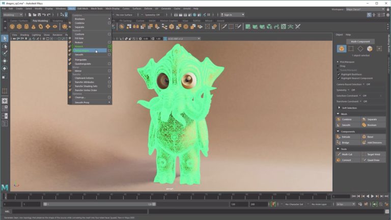
FR: We have a unique pipeline here at Digital Domain commercials. We actually modeled in [NewTek] Lightwave, we rig and animate in [Autodesk] Maya and then we go back to Lightwave for the rendering. It’s very fast. We have custom software tools that allow us to easily “pass off” from package to package. It works for us, and we’ve been doing it for years. And, as I mentioned earlier, we composite in [Autodesk] Flame and Nuke.
FR: I really didn’t look at it that way; I usually try to see what will serve the story and the visuals properly. I also try to look at what will create the desired illusion in the best way. In this case, when I put the guys on the reflective surfaces, the light bulb went on.
Another major concern when adding computer-generated anything to a live-action scene is “grounding” (making sure the item that you’re adding to the scene actually feels like it’s on the surface that it’s meant to be sitting on). When your characters are seen from head to toe, this is a HUGE issue. You can have the most kick-ass animation ever, but the illusion will be completely blown if it doesn’t look like the character is actually on the surface. It’s not such a big deal when you’re looking down on the guys, but there are a ton of shots where the camera is eye level with the characters. The grounding will either make or break the illusion. Some had bad grounding; others had good grounding. Your eye knows something is wrong, but the untrained eye can’t really figure out what it is or quantify it.
One of the other things that we were REALLY conscious of doing was keeping the depth of field shallow-especially when we were on eye level with the little guys. That is to say that what is in focus is a very narrow sliver. So, when you look at the final project now from the same ground perspective as the little guys, you can see that the stuff immediately in front of and behind the key character is out of focus. This adds a level of photographic reality that the eye and the brain can’t argue with. But we had to make a conscious decision to do this before we shot a frame of film.
FR: We had two deliveries. One that was a “hard delivery” which was the drop dead date where the spot had to go on TV. We had about three to four weeks from the locked cut to get that done. Then we were given another three weeks to do a “soft” delivery so that we could do a :60 that had [additional scenes] that didn’t make it into the broadcast version. Though, we did start building the men as soon as the job was awarded so we could get a jump on things.
FR: I’ve done tons of live action mixed with animation. It’s my favorite thing to do, because I’m still nine years old in my head. I love animation. But EVERY project has its unique opportunities/problems. So, the answer to your question would be yes-and no.
FR: For starters, the creative was great. The character design and the animation were really fantastic. Dante’s direction-I mean, he just got it. REALLY got it. Some guys don’t. He added so much cool stuff to the original creative. We had all the right ingredients for a successful spot.
I was pretty blown away at how easily Dante came up with the story and the blocking on the tech scout. He was also pretty meticulous about shooting reference for each animation shot. Production has to move REALLY fast so most directors try to keep things moving. If you decide that you want to shoot reference for EACH setup, the production is going to move very slowly, making EVERYBODY nervous, especially on a short schedule.
FR: Pretty satisfied-and a little disappointed at the same time. But all projects go that way. There are always things that you would do differently; things you’d like to polish. I’m my own worst critic. That’s why it’s so valuable to have someone keep a fresh eye on the work. I’ve only had a handful of projects in my career I was perfectly happy with when I was done. You very rarely get to polish a project to perfection. I don’t want to sound like a gloomy Gus, though. Seriously, this is a pretty cool spot. And I do have a pretty cool job.
Did you enjoy this article? Sign up to receive the StudioDaily Fix eletter containing the latest stories, including news, videos, interviews, reviews and more.


Leave a Reply