How Nailgun* Got in Touch with its Inner 12-Year-Old
“People don’t do IDs like they used to,” he says. “But we love looking at someone’s brand and creating spots that tell who they are in an artistic way. Nicktoons has always been a great client. They know their brand, which makes our job a lot easier.”
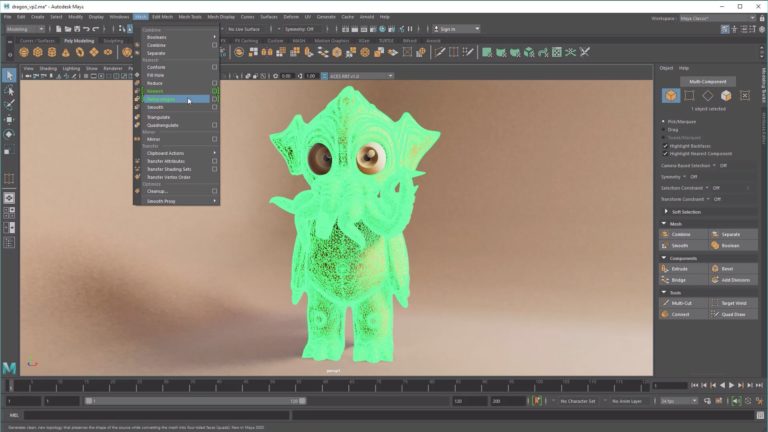
Waldron describes Nailgun* as a hardcore After Effects/Maya/Final Cut Pro shop, but says he always finds his team looking for that standalone piece of software that can handle a particular effect just right – in this case, Nailgun* used Blast Code to handle cracking and breaking ice. Check out the hyper-kinetic videos, below, than read Waldron’s explanation of each little bit of 10-second storytelling.
Pull the Carpet
This one was the most abstract and surreal. We wanted to show a cool, fun location – not a location that was hyper-real, or that was something we’d ever seen before. We had a desert vibe going on, and we created a carpet texture that was part of that world. It felt like a place you might know – but when you see the details, you realize you’ve never been there before.
And suddenly an action happens off screen – it’s like pulling the carpet, or pulling the sheet off the table. Like any action movie, you have that one moment where you realize something is going on. It’s happening far away, but you start to hear and feel things. You might see something happening in the distance. Then all the tiles fly up, into the world, when the snap happens. Huge type is flying through and tumbling into the screen. It starts to be an out-of-control stampede of flying Nicktoons type.
We played with the camerawork, slowing the camera down and getting a moment to take it in. It’s a very complex scene. We had to figure out particle systems to render all of these things. At one point, the letters all sort of line up, and we pitched the idea, what if it crashes into the camera lens? You’re sitting there at home, and it breaks your TV. That was the idea. And the camera pulls back to see it.
Usually in the first year [of a new brand] there’s logo police, and they have all these rules about how the logo has to be presented. As a designer, you’re trying to break those rules, but hopefully to benefit the client. And we asked, “What if it all hits, but it doesn’t line up properly?” And they said, “That’s cool. Try it.” Nicktoons feels confident about their brand, and they know their audience really well.
Thunder
“Thunder” got them super-excited. We started off with illustration-based concepts and some 3D. It was very complex, There was a lot of cel animation in this spot, mixed with [Next Limit Technologies] RealFlow water, mixed with 3D in Maya. When those waves start coming up, those are all drawn out. The drip from some of the letters when they rise up is hand-drawn.
We wanted to do it all in RealFlow. The problem is you can’t get the detail you can if you’re drawing. Really, to get that look – that motion inside those waves – all we could figure out was to draw it. And then, how do you connect the drawings with RealFlow, which is super-hard to control? And how do you connect that with the After Effects elements?
We wanted the camerawork in each spot to feel different. This one was like a boat out in the water, bobbing up and down. It felt very fluid, and it had a cinematic editing style. When the letterforms are rising up, we used a wide-angle lens in Maya, which meant we had to draw the illustration to look like a wide-angle lens, and then we had to play with the distortion in RealFlow to get all the elements to line up properly. It got very complex very quickly, but I loved the story of the “N” rising up, being brought to life by this lightning bolt. This is a story you’ve seen in movies as well. It’s a scary moment, and then everything settles – it’s not wreaking havoc on the world, but bringing light.
Glacier Cave
There are similar scenes in this and “Thunder” of Nicktoons being revealed and escaping into the world. We loved the idea that this logo has been frozen for many years, and suddenly it starts to come alive. We didn’t want to give away the fact that it was the Nicktoons logo right away, so we cropped and composed it so it was a story building up – these letter forms are escaping. The challenge was that, when you start playing with ice in 3D, with light reflecting and refracting across the glass, things bounce around. We played with different apps, but Blast Code was the one to break the ice, so to speak.
It starts coming to life, breaking the glass, and the light shines behind it as a massive energy source that gives it the ability to break apart. There’s a big blast, where the whole world blows up and ice crystals start flying around. That’s where we play with speeds of the camera and movement. Nicktoons is released and falls back into the scene with an amazing low behind it. Nicktoons is in the real world.
The toughest aspect of this was really just figuring out the ice. You can do cracks and breaks in Maya, but you don’t get the amount of detail we were looking for in this spot. And it’s a very clear story. You can tell this story in 10 seconds, but we wanted to make sure it was easy to understand, and there had to be a cool factor in seeing all this happen.
Popcorn
We love to play with typography, and so does Nicktoons. We started with a simple, 12-year-old’s city. It’s a stylized, fun place. We played with different looks – some were too dark, some were too realistic – and created this graphic representation of a city. All of a sudden, the ground explodes and knocks the camera back. It falls and lands on the ground, and we start to see tons of type shooting up into the sky. The idea is that when you have old-school popcorn on the stove, it explodes and builds its way up. We wanted the type to be like that – the Nicktoons typography was trapped below the ground, and it finally escaped in a massive explosion.
We played a lot with different particle systems to get the movement. We used Blast Code again for the ground [cracking and opening up]. We had a lot of keyframed letterforms that fell to the side and out of the stack. As the camera goes up, following it into the sky, the thing gets so tall that it starts to wobble and type starts to fall off. The camera goes as high as it can, then it stalls out and falls back down. The camera flies down, we see flashes of sun hitting the pieces in slow-motion, and they line up and make the Nicktoons logo.
When we sketched all these out, we had to explain to [the client] why the world was sideways. We had to do a lot of animatics. They were signed up to do something different, but they didn’t understand – until we had the first real cut, and then they got really excited.
For a ton of boards, animatics, and other making-of materials, visit Nailgun*’s Vimeo page dedicated to its Nicktoons IDs.
Did you enjoy this article? Sign up to receive the StudioDaily Fix eletter containing the latest stories, including news, videos, interviews, reviews and more.


Leave a Reply