How Dive Subtly Accented a Low-Key Vampire Movie
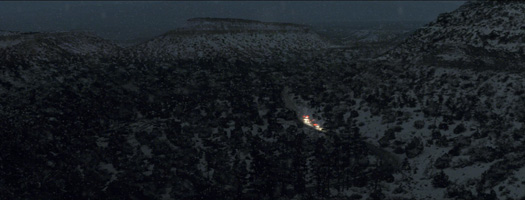
And the film opens and closes on two long takes that have big implications for the characters. In the closing scene, set aboard a train and photographed with green screens outside the train's windows, one of the film's characters is traveling into unknown territory. And the film's opening scene is a single establishing shot of the wintry desert landscape near Los Alamos, New Mexico, as the camera pushes in slowly. "Matt [Reeves] has somewhat of a Hitchcock methodology of creating a whole story within a shot as it evolves over the course of a very long take," Forker told Film & Video. "Matt declared that the opening and closing shots were probably his two favorite shots of the film, and he had a lot of ideas for what to do with them. We felt privileged to work on them." Mouseover the images below to compare before-and-after examples of Dive's work on two shots from the film, then read Forker's commentary on how they were created.

We split this matte painting into a number of tiles, in X, Y, and Z space, and re-did the camera move that already existed on the plate. Matt wanted different things happening in deep space than in foreground space. The biggest thing was the addition of snow, and the enhancement of the trail of lights cutting a path down the snaking road through the snow. When we first open on it, it's a tranquil scene of snow falling, but the snow increases as the shot progresses, it gets a little bit darker, and then there's the surprise of the caravan of emergency vehicles coming down the road.
There were other roads and other cars in the shot that we didn't want you to see, and we emphasized the shape of various plateaus and other landforms in the shot through minor matte-painting tricks and shadowing. We spent a fair amount of time on things people would never see – the depth of field of snow, how far away the first [Maya-generated] layer of falling snow was from the camera or how close.
And we sort of relit the scene – it was day for night, but not 100 percent. We experimented with a fair number of ideas in order to get to the final decision of what it would look like. There were a number of passes and versions, but at the end of the day it's not supposed to look complicated. I knew Brad [Parker] quite well from Digital Domain, and he was really looking at the work we did on The Road as an indicator that we could help tell a story with visual effects.

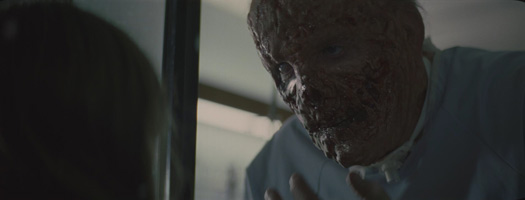
The face-replacement work [for Richard Jenkins' acid-scarred character] was less like what we normally do. I don't know why just his nose had the green make-up on it – as if only the nose would have a bit of removal done. In the end it was a much bigger part of his face that was affected digitally. Our first mock-up of the models was very close to what the concept artist [prior to us] had done, but when you put into all the shots and various angles, it became a very odd almost-sneer on his face, a smile that looked almost like the Joker in Batman. It was so weird that it almost seemed comical.
In the little movement that existed in those shots, it was clear that very significant parts of the face had been removed and – at least just for a glimpse – you would see up into the cavity of his skull. A little bit – nothing's over the top here. We did the model for the face three or four times before we settled on it, and then went through the normal exercise of modifying the textures and the lighting, and of course there are tracking and compositing issues with making it fit. A lot of times you spend time on the model and the textures but not enough on the comp to do justice to the model. We made sure, in the schedule, that we left enough time for all that to fall into place. That sequence was definitely one of the last to be delivered – within the last minutes of the delivery schedule.
When we get more work, we go virtual. We have a number of partners outside Dive that we use for some of the work, and Invisible, which is a company up in Toronto that we worked with on The Road, did the 3D model and texturing for the face replacement. They did great work. The face model was created in Maya, and there was a fair amount of roto. You have to find some tricky ways to integrate the mask with the original face, and that requires some custom roto mattes, and then obviously the roto that gives us the ability to replace the background where there is no more face. Every process is going on there, from models, textures and lighting to compositing and roto. Everything is in a shot like that.
Did you enjoy this article? Sign up to receive the StudioDaily Fix eletter containing the latest stories, including news, videos, interviews, reviews and more.


Leave a Reply