Seth Henrikson: They told us they were going to show it in dealerships. They sell a lot in Grainger [industrial supply] stores. It's specifically for contractors, so they wanted to get it in front of industry professionals and to have it at trade shows.
So what was Odd Machine's involvement? Were you part of the creative development?
This was a really great job for Odd Machine, given what we've aspired to build. We've aligned a wide-reaching pool of talent, some of them on staff and some of them freelance. We were able to work with this client from conception through post. They came to us and said, "We've seen your work and we like it. We haven't done video before, and we want this to be really cool. What would you guys do?" So we wrote the script and we boarded it. And they handed it over to us.
What about the overall concept? Where did that come from?
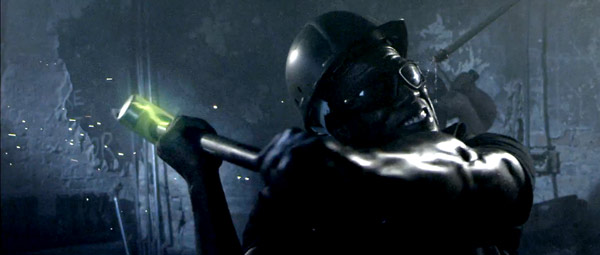
They had looked at other work we did and referenced pieces that we had done that they liked. The name of the sledgehammer is B.A.S.H., which stands for "bad ass sledge hammer." They told me that, and I said, "Well, this really need to be bad-ass." My gut reaction was to take a demolition site and make it resemble a post-apocalyptic war zone, and then shoot it as if these guys were going to do battle with this building. I said, "Let's give it a James Cameron-esque or Ridley Scott's Alien kind of feeling." And their eyes lit up. It was a great opportunity for us to show what we're capable of.
What camera did you use?
We shot with the Red at, I think, 1080.
Talk a little bit about the VFX work. Where did the ideas come from?
We wanted to communicate that it wasn't just that these guys were muscly, but that the hammer itself was unique and different. That it had these special powers. Hence the glowing effects to keep the attention on the hammer — which is a little difficult! Also, we shot it in slow motion. Not super-high-speed, but someone swinging a hammer is moving fast, even slowed down. And we created a dark environment where the bright green head would show up.
What was the biggest challenge of the project?
Well, I got really excited and sold them on an idea. And then the reality came together. You can talk James Cameron and Ridley Scott, but if you don't have that budget you have to get as close to it as you can with the resources you have to work with. It sounds easy. "Oh, we're going to have these guys smash through a wall." But can they actually do it? A brick wall is a brick wall, and the product is just a hammer. So a lot of work went into special effects, set design, and props.
How did you find the location?
We found a building in the process of being rehabbed. We actually shot in what will be a brewery in the future. It was full of piles of brick and steel and cables. We went into an area that had been rehabbed and brought all the crap back in, dressing the set with real bricks and rubble and glass. We brought in pipes with running water so it looked like they were leaking. We brought in spark effects. We made it look like a dangerous place. With three of my clsoest collaborators, I spent just over a week building that wall, and then I brought in a special-effects artist her ein Chicago to make bricks out of foam, with fake mortar to go in between the bricks. That shot with the bricks flying at the camera? Those were styrofoam bricks we blew out toward the camera with air cannons filled with prop dirt and spark effects.
How about your lighting set-up?
Part of the reason I chose that location, aside from the angles and the depth of the space, was that one wall was a glass block facing west, and I knew that because we were shooting slo-mo we would need a certain amount of light. I wanted a blue, cool tone to play up the night feeling, so I used the daylight as an ambient base that gave my lighting a blue hue, then I brought in lamps to highlight other areas in the set above that base, and then let everything else fall into black
How happy are you with the finished project?
I can't believe we pulled it off with the resources we had. It was a one-day shoot, but it looks bigger than just a small production. The most important thing this job displayed was the team of artists we worked with. Two of them, by trade, are puppeteers, and they have a really interesting way of looking at things. Oftentimes, being puppeteers, they have to build crazy contraptions, and they have an awesome sensibility. So I feel really lucky that I've been able to surround myself with these people.
Credits
Director/DP: Seth Henrikson
Writer/Asst. Director: Alec Pinkston
Line Producer: Elizabeth Collins
Production Coordinator: Nav Singh
Set Design/Sculptor: Greg Hinchman
Set Design/Sculptor: Lolly Extract
Set Design/Sculptor: Amber Marsh
Special Effects: Geoff Vinns Calvay
Gaffer: Scott Baerhend
Executive Producer; Kimberly Berman Walsh
Editor: Chris Segich
Colorist: Debra Segich
3D CGI: Cary Janks
2D: Eric Muro
For more information: www.theoddmachine.com.
Did you enjoy this article? Sign up to receive the StudioDaily Fix eletter containing the latest stories, including news, videos, interviews, reviews and more.


Leave a Reply