Though This 64-bit Version Moves Faster and Looks Different, the Overall Workflow Remains, Comfortably, the Same
New Look, Old Feel
If you already use Media Composer and haven't yet upgraded to version 6, you might be quite shocked when booting the application after install. The interface has changed significantly in a few key areas that, in the Macintosh version of MC6, I noticed right away.

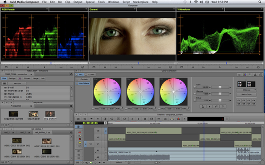
At first glance it really looks quite different. The interface, seen above, is darker overall, though that can be changed in the settings, and the active window now has a brown or gray title bar (depending on your Interface settings). Instead of the usual round red, yellow, green Macintosh window control buttons, they've been redesigned into red, yellow, green squares. There's also some subtle background shading that makes it easier to distinguish between lines of text in the project window or a bin.
![]()
The timecode displays above the Source/Record monitors have been revamped to give them a new look.

The Audio Mixer, above, now resembles a mixer in the physical world more than the computer world, obviously coming from the ProTools universe.
Those interface windows were the most noticeably changed, and there are several other visible changes. But on closer inspection, I discovered that what at first glance looks like a radical overhaul of the interface really isn't all that different from previous versions. This is an important distinction because it means that an experienced Media Composer editor will be up and working in no time. There will a small adjustment period as users get used to the interface tweaks, but it should be minimal.
Most of MC6's signature new features are under the hood. The port to a 64-bit operating system in the short term means MC can address much more RAM. In the long term it means Avid should be able to build features into Media Composer that wouldn't have otherwise been possible. I've seen quite a few improvements already in this new architecture.
I'm most impressed with the better response and fewer screen redraws while working in Frame view in a bin. Working in previous versions, I'd often be stuck as MC paused and redrew the frame icons-for quite a long time if I had a lot of open bins. I didn't experience this at all with the several edits I've put through MC6, even when there were multiple, overlapping bins open. Waveform display in the timeline feels much snappier as well.


New Third-Party Hardware Options
This has been a long time coming but now MC supports pretty much all third-party hardware using the new Avid Open I/O. I've long been using the first-ever supported hardware, the Matrox MXO2 Mini. I love that little box because it is small, portable and even provides H.264 encoding acceleration with MAX technology. But 6 extends that kind of support for devices from Blackmagic Design, AJA (more than just the Io Express), MOTU, Bluefish and a few more from Matrox. 

For this review I tested both the Blackmagic Design Decklink HD Extreme 3D (the control panel is seen below), the AJA Kona 3G and the Matrox MXO2 Mini. They all performed perfectly. Install the proper drivers and they just work when booting into Media Composer. You'll see a Hardware Setup option at the bottom of the Tools menu that will launch the third-party hardware control interface outside of Media Composer.


Display, playback and scrubbing were all as smooth as working with Avid hardware. If you're a longtime Avid user who never thought you'd see a day when there would be so many hardware choices, you're not alone. What's great is that there are also now some affordable new prices for actual Avid hardware. You just have more choices. Here's what the AJA Kona 3G control panel looks like in MC:

Another simple but incredibly useful interface change is the addition of tabbed bins (seen below). Drag one bin onto another (or more) and they join together with tabs across the top. Drag a clip from another bin onto a tab and that bin will pop forward so you can drop the clip into that bin. There's also a small arrow in the upper right corner of a bin that is a pop-out of all bins in the tabs. It's a simple, handy way to work that beats the SuperBin-which is thankfully now gone-by a mile. The real question is: what took so long?


A casualty of the tabbed bins, however, is the loss of the Brief, Text, Frame and Script display tabs that were atop pre-MC6 bins. They've been moved to a pop-up in the lower left corner of a bin. Brief is gone completely. That's one of those small changes that may hit the muscle memory of experienced editors hard, but IMHO it's a price we should be willing to pay for tabbed bins.


What we don't yet get is a tabbed timeline, which is odd, since it would make sense as part of the new tabbed interface. You can still load a timeline into the Source monitor, as before, and view that timeline via Toggle Source/Record in Timeline. You can also drag different tools together into a tabbed window (seen below), such as the Avid Calculator, Markers, Hardware Tool and Audio Mixer. This is a great way to manage screen real estate.

I don't do any stereoscopic 3D editing but I've heard from a couple of editors that the MC6 new stereoscopic support is very well done. I can't comment but if you're interested in the 3D support then Avid has a web page dedicated to just that: http://apps.avid.com/Get-trained-mc6/working-in-stereoscopic.html.
Hello to ProRes, 444
New codecs are a big addition to MC6. While Media Composer has been able to play back Apple ProRes via Avid Media Access for a while now, MC6 has added ProRes as a native MXF codec. Macs can encode and decode ProRes while Windows can only decode. This means all flavors of ProRes can be written natively as well as rewrapped from a .mov to .mxf. Why is that important since we've been able to use ProRes via Avid Media Access for some time? Native .mxf files are always preferable, as they are less likely to cause playback problems or relinking issues. With native MXF comes the rock-solid media management that Avid has been known for. AMA is getting better but it's still not as perfect as native MXF.

This release of Media Composer also introduces a 444 version of Avid's DNxHD codec (above). With DNxHD 444 there is codec parity between ProRes and DNxHD. Nice. Now Avid users will have a choice of which to use and won't have to compromise on media management.
A New Marketplace
There's a new menu item in MC6 for Avid's Marketplace. This is an in-application way to browse, download and buy stock footage, music, audio and video plug-ins, as well as support and training. It's a cool idea and at least for some, should prove especially useful for stock footage.

Create an account with a stock footage house and you can search, browse and then download offline stock footage clips that can be edited right into a sequence. When done you can generate a stock footage report and buy the clips that were used in the edit. I don't use a lot of stock footage but I can see this simplifying the process considerably. Currently the stock footage offered through the Marketplace is restricted to Thought Equity. Here's hoping Avid will add other suppliers in the future, making it a really useful way to interact with stock footage libraries.
When clicking through the Marketplace it really feels like this online component is just a web browser added to Media Composer, which I guess it is. Unfortunately, this first version of Marketplace feels a bit tacked on. It would be great to be able to download demo versions of video plug-ins and then purchase the full version if you like the effect. I'm sure Marketplace will become more refined as it matures.
A Few Bugs Here and There
The release isn't perfect. There are some rather annoying bugs that evidently crept in during the 64-bit rewrite (though, to be fair, some may be from an earlier version). A few that annoyed me:
- On the Mac, the F1 key on the keyboard now opens the Help menu instead of performing what it is assigned.
- When typing in the name of an item in a bin the UP and DOWN arrows on the keyboard no longer jump to the front and end, respectively, of the text string.
- The Enter key on the keypad no longer closes up the Marker window text entry box, instead giving a line break like Return.
- I've often seen an odd frame jump when JLK scrubbing just a second or so after I begin JLK scrubbing.
If you search around the Internet you can find a few other bugs as well. I expect most of these will be fixed quite soon.
Rating: Sweet?
Overall I give Avid Media Composer 6 a rating of SWEET. There are still a number of new features that I didn't cover so be sure to read all the details and download a full featured demo on Avid's web site. So why did I give Media Composer 5 Studio's highest rating of HOT? Is version 6 somehow a step backwards from version 5? That's not my point. Version 6 really is better in almost every way, since it takes everything that is good about Media Composer 5 and builds on that. I'm giving this one only a SWEET rating for a couple of reasons.
First, we have to look at the big picture that is version 6 and its competitors. Say what you will about Final Cut Pro X but it jumped out of the gate with many modern features that Media Composer lacks. Things like auto-analysis and repair of footage, background tasks and a fluid, albeit radically changed, interface are things that Media Composer just doesn't have. Adobe Premiere Pro has also been rebuilt to harness modern hardware with its Mercury Playback Engine and provides some staggering playback performance in the process. Media Composer 6, on the other hand, doesn't have any of these more modern, advanced features — at least not yet.
That brings me to the second reason I knocked MC6's rating back from the one I previously gave MC5. The porting of Media Composer's old code to a more modern 64-bit architecture means that in the near future Media Composer will be able to take advantage of more of those modern features. A more interactive timeline is one of MC's most requested features so that should be high on R&D's list. While MC6 looks a lot different than MC5 it doesn't necessarily feel that much different-maybe that was Avid's point, given what's happened in this market. It does feel speedier overall when I'm working on larger projects and I have noticed improved performance with bin thumbnails, waveform redraws and things like that. But there are workflow improvements I experience in other NLEs that haven't made it into Media Composer yet.
Now that 64-bit has opened the door, I'm most excited about what will be coming to Media Composer in successive point releases and full versions.


Avid is a horrible company…they have no customer support. Good luck if you ever need to contact them about anything, you have to buy an avid support code…no lie. This company needs to go the way of the dodo, any company that charges for customer support needs to be avoided. Good luck if you do buy their product, but don’t say I didn’t warn you.