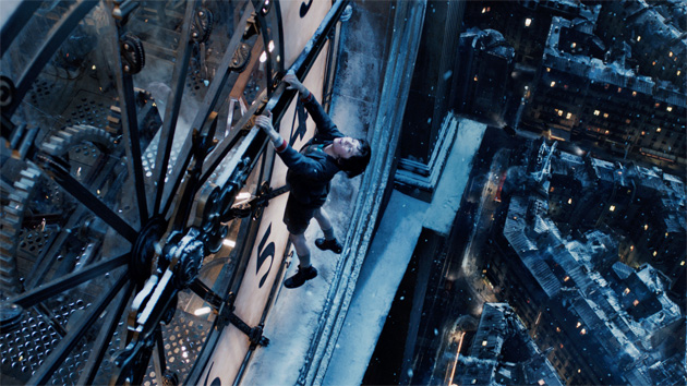
Legato shares his Oscar nomination for Hugo, his third Oscar nomination, with special effects supervisor Joss Williams, visual-effects supervisor Ben Grossman at Pixomondo, and Alex Henning, digital effects supervisor at Pixomondo. Directed by Martin Scorsese, Hugo, which is based on the award-winning children's book The Invention of Hugo Cabret by Brian Selznick, tells the story of an orphaned son of a clockmaker, who lives in a secret part of a 1930s Paris train station and winds his way into the heart of Georges Mà©lià¨s. Watch Pixomondo's VFX reel, below, then read our Q&A.
Rob Legato: There's something about the subject matter and what it celebrates that is special and unique to people who work in the business for sure. I don't think anyone can help but appreciate the art of the magic, literally the magic of movies by the first visual-effects supervisor, the magician who created the vocabulary we use today to transport us into another land, another day.
But we also like to think that on this movie we took visual effects and turned it into the art of it to transport people back in time in an evocative way. The art of the images is something people strive for. Everyone has the same tools and we can all do the same explosions, but we can also use the tools to create a tone and beauty and art. And I think there was an appreciation for that. At least, I hope there was.
It sounds like working on Hugo was a unique experience.
It was a joy to do. I think Marty [Scorsese] showed so well the joy that Georges Mà©lià¨s had directing his movies. That's infectious and it infected the crew. It was a long film to work on. To keep your momentum requires inspiration and I think that happened.
Do you have a favorite shot?
The opening shot was the first one we designed and the last one we completed and it is probably the best reviewed shot I've ever done. Somehow that shot resonated. There's something about being transported into this landscape all in one piece that sets the tone for this movie. It had a lot of what I was trying to achieve in it. I didn't calculate the impact of it; it was just the best way to tell the story and melt you into the world, and sometimes you make magic.
Was that opening shot the most difficult?
That shot set the benchmark for the most difficult challenge. It's easy to put something "back there." It's difficult to create the largesse of the set right, everything past the actor's head. We were dealing with the greatest collaborators, Dante Ferretti [production designer, ten Oscar nominations, two Oscars], Francesca Lo Schiavo [set decorator, eight Oscar nominations, two Oscars], and others. Every department was heavily steeped in the art and craft on the highest order, and our work had to fit into that. The lighting and staging that Marty would do, the sets Dante would do, the art direction and set dressing Francesca would do. We were asked to rise up and do, invisibly, what they do in the movie with an impossible shot that we could only get [with visual effects].
What was the most challenging artistically?
Half the movie is a visual effect. And, it all had to feel like it came from one artistic source. I am so impressed with the caliber of people we were graced to be working with and the hardest thing was to not let them down. Everything had to be up to their caliber. Even though they might not have much to do with what we were doing, what we did would appear like they did it. If we made something invisible and mediocre, it would make Bob Richardson's [cinematographer, seven Oscar nominations, two Oscars] photography look not as good because half of it was lit by someone else. All the way down the line, even to the extras' costumes. We rejected things that on another film we might think were great. We had to make a statement, and the statement was how beautiful the film is.
How did you achieve that?
The answer is like answering "How do you compose music?" At some point the artistry transcends the mechanical ability to put notes on paper. It's harder to talk about than do. I guess to some degree, it's a mystery.
You achieve it the way they achieve it, by getting into the art of it. It's every choice you make. It's where Bob decides, based on his years of experience, where to put a lamp. Putting it in one spot rather than another is the art form. Where, what it's aimed at, the exposure, how it blends. When Dante designs, he builds on his years of experience. A lot of people can direct a scene, but few can direct like Marty. Marty sets the tone. We had many conversations with him and he made judgment calls, but even if he didn't say another word, if you sandwiched in a shot that didn't fit the tone, you'd know it was incorrect. And, you don't live with that.
The first thing is to set the bar: It's not OK to just fill in the frame. Then you search for people who understand what you're going for. When you're dealing with hundreds of people, you cast them. Some of the best artists might deliver mediocre products on one shot, but on another, they shine. So you remember the artist who did that shot.
In our case, the visual effects are not a gag you can apply on top. The skill is in rejecting pieces not up to caliber. It's the thousand decisions that go into it. Is it framed correctly? Is it on screen long enough or too long? How many lamps to light it? What is the exposure, the coloration? It's a sum total of all those things. Once you set the tone – what we'll accept and what we won't – everyone steps up to the plate. The artists appreciated the artfulness of it. The best artists were self-motivated to match the rest of the movie.
Who did you work with on the film?
I had worked with Ben Grossman on Shutter Island and "The Key to Reserva" and I knew he was good. He had never worked at Pixomondo, but I saw them do procedural animation perfectly, and we had to do steam trains. There was something about the way they did it – I knew we could get there with them. I knew they could do something beautiful. I asked Craig Barron [Matte World Digital] to do a few shots and help me talk to the matte artists at Pixomondo to help communicate possibilities, assist with the subtleties, help them understand when something didn't work for me. We had Uncharted Territory do some work. And we got some last minute help from ILM and John Knoll. But 90 percent of the work was by Pixomondo.
Who did the previs for the show?
I like to do previs myself because I can. I'll design sequences from Marty's notes, my notes, talks with Dante and Bob, then go off and do it. It's not something I like to give to anyone else because my focus is not the effects but the shot. We can figure out later how to break things apart, but we have to think of it artistically first. I think that order gives you the greatest result. Start with the art. Then break it down, making sure all the ingredients are high quality, with attention to lighting every step of the way.
How do you do the previs?
I set up a thing similar to what I used for Avatar, scaled down, because the only way I can create things is with the orientation of a camera person. I think it's easier to have free access to a movie camera in real time to find the shot and then sit in judgment. Edit, put it together, look at the tone, shoot another. That's part and parcel of what we're talking about. To not just see the shot, but set the composition and evoke the mood.
What equipment do you use? What does your studio look like?
I basically have a mini crane arm. I hand operate the crane, but it has a fluid head like what you'd have on stage. As soon as I pan and tilt, I see it live. It goes through [Autodesk] MotionBuilder, which talks to the fluid head and crane, so I have real-time feedback, just like with a mouse. I have the [digital] background, the [digital] actors, a 360-degree view of the world. I pick and choose lenses verbally, then I look at the monitor. As soon as I like a take, I play it live and record the camera. Then I send QuickTime movies to the Avid and cut them into the sequence. I show that to Marty [Scorsese]. For a couple scenes we picked an image from the book that was evocative, and created a setup using that. For the dream sequence, we found shots of the steam engine and put it in exactly as it was in the book.
Did you previs in stereo 3D?
Yeah, I did, and that was part of the reason the stereo worked as well as it did. The opening shot was the first I did in 3D and once we saw it in 3D we changed things, made it more evocative. We considered 3D for every setup, viewed and altered it for every setup. Once we could see it, we'd add foreground, dust, change how we lit the shot, stage the actors to take advantage of the art form of depth. This film was totally designed as a 3D movie, never as a 2D movie with 3D to be added later. It was photographed in 3D, all the takes were judged in 3D, all the previs was in 3D, and it was cut in 3D. We looked at how depth enhanced the telling of the story. The sum total of all those things created a feeling that's different from post conversion.
Did you use practical as well as digital effects?
As many as we could. The physical effects helped enormously. I always like to shoot whatever I can live because my belief system is that creativity is analog driven. You can take a camera and walk around until your senses tell you you're in the right place. And if something is live and in camera, you have that ability to know this take is right. It's somehow easier to do it in realtime and judge it that way.
Everything was an homage to persistence of vision, to [Georges Mà©lià¨s'] original vision. When you watch him in his flashback scenes recreate these indelible images – we got moved by it. The gears were beautifully filmed on a set that was safe, and then we took that idea of how they move and operate. For the train crash, we had a green car to help feel the mass. We used a stop-motion mouse. We made it look and feel like a vintage mouse Mà©lià¨s would have created in the first place. We created Mà©lià¨s' glass house. It does something to you that's hard to define.
Do you think this film points to a trend in visual effects?
Visual effects are so sophisticated now. At the bake-off, you could see that what was a miracle 10 years ago is commonplace now. It's common to have computer sets fill in backgrounds. So, now we're at the point where it isn't whether it's believable, it's how well it's done. How artistic. It isn't enough to put something good in there. It has to be great.
One of the things we did is show that 3D can be embraced and used like any other piece of cinema. It's like lighting, acting, staging, music – another tool to tell the story, not a gag or a gimmick. And neither is visual effects. It's how you tell the story in an artistic way, not a technical way.
The industry has grown up. It's akin to the beginning of movies, when the gag of a train crashing through a station was enough. Then, that wasn't enough. People started using movies to tell stories. And then, interesting stories. Sound came in, and then not just sound. Scriptwriting became an art form. Color was garish and loud at first. Then art direction came in and set mood and tone. Now we're in the visual effects age. CG could do anything, but not well at first. Now, it's starting to do things well. And that's because of the caliber of the people. It's the artists of visual effects, not the art.
I think people get tired of a steady diet of superheroes, however much fun. There is a sense of pride in creating something simple and beautiful, creating a nice photograph framed properly, creating a beautiful tone in the lighting, rather than 50,000 elements. The great thing about this film is that the visual-effects artists loved working on it. They got to participate in the art of something.
Did you enjoy this article? Sign up to receive the StudioDaily Fix eletter containing the latest stories, including news, videos, interviews, reviews and more.


Leave a Reply