How DaVinci Resolve Helps His Subtle Grade Fuel the Story
Scott Klein, a senior colorist at Technicolor Hollywood, has helped create the looks of some of television's most iconic shows, including Miami Vice, Dark Angel, The Sopranos, Deadwood and Entourage. Since the pilot in 2007, he has also graded every episode of HBO's True Blood, which will complete its sixth season this Sunday, August 19.
A graduate of Boston's Berklee College of Music, Klein was a touring guitar player before moving to Los Angeles to begin his career in film. He's been honored with a Hollywood Post Alliance nomination for his work on True Blood and is the winner of two International Monitor Awards for Best Color Grading. We spoke to him about the evolving color conventions of the show, working with temp tracks while he grades and finding the right balance between the overlapping real world of telepathic waitress Sookie Stackhouse and the unreal yet equally stratified world of vampires, faeries and their hybrid relations.
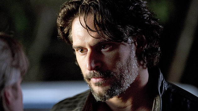
Photo (top): Joe Manganiello as Alcide. Photo by John P. Johnson; courtesy HBO.
StudioDaily: You've worked with a lot of different directors on the show, from star Stephen Moyer to Heathers director Michael Lehmann. How does that affect your working style as a colorist?
Scott Klein: I’m not really working individually with the episode directors when it comes to setting looks per-se, unless something special is called for. The executive producer, Gregg Feinberg, and I have been working together for over 10 years on multiple projects and at this point, I have a pretty good feel for what he's going to want on playback day. I have also been working very closely for years with the cinematographers David Klein and Romeo Tirone, as well as Matt Jensen, who has worked multiple seasons on the show, so I have a pretty good idea of what’s called for. There's been a pretty unified creative idea of what the show looks like and how the story conventions interplay with the various looks. The looks help support the mood of the story and the unreal nature of this back-and-forth between real-world drama and the supernatural world most of the characters live in. The episode directors typically work from the tone set by the cinematographers and within those conventions as well.
From my point of view, when Gregg comes in we run the show with all the color-correction finished and ready for air. There are times I've guessed wrong on something or didn't quite get the prevailing mood that was intended in the scene, and we make a change on the spot. For the most part, we're pretty much in sync when there's a tone change in the look.
Where do your other cues come from when you grade?
For me as an artist, I always try to focus in on the story and the timing of the cut. When I go through the show I actually play back picture with the temp sound tracks on top. I'm listening to the cut of the dialog and the temp music that they've put in in the cutting room. There are a lot of mood cues that I get from that. I also reference things we’ve done in the past that worked and possibly add something fresh that works for where we are now in the show. Some of it is instinct, based on my experience with the filmmakers throughout the history of the show. I'm always putting my spin on it. Hopefully I’m guessing right more times than not. I try to let the story be the main focus of the scene that you would hang a look on, and not the other way around.
Would you characterize True Blood as a color-intensive show?
We do a lot of color-correction on the show. Some of it is straight color-matching. Most of it is creative, including lighting things that need a little help or possibly to cloak some of the light to make things a bit more mysterious.
Has the series been shot with the same cameras from the start?
It has. The lens packages have changed up, depending on the cinematographers, but it's been a three-perf 35mm negative show from the beginning. For the past four years, we've done a digital scan of the negative and done software color-correction coming off of DPX files.
How has that influenced the content?
There's a lot that can be said about the magic of 35mm film negative as a shoot medium. On the air it really lends itself to the feel of the show in term of the expressiveness: the focal lengths, grain and an overall feel. Very soulful. But we've also used a lot of the software tools that go hand-in-hand with an effects-heavy, modern TV show.
Has there been any discussion among the creative team about going completely digital?
It does come up, not only because of the more streamlined process of posting from digital capture, but now it looks like it's becoming a little bit less of a choice because guaranteeing availability of undeveloped stock for the whole season is getting more challenging. There have been discussions about switching out to digital before Season 7, but I'm not sure what will be the result.
How long have you been grading on the Blackmagic DaVinci Resolve, and what's your setup?
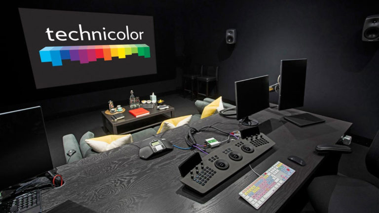
I'm using the DaVinci panels and I'm running 9.1 software. I'm really looking forward to upgrading to the new version. It's a great platform in terms of the toolset. I particularly value the ability to version different scenes that I can quickly show the creatives, toggle back and forth really quickly between different looks, etc. I think the node tree structure is very flexible, and I like how easily I can pull away different elements of previous color corrections, cut and paste them and add them to the one I'm working on. I faithfully keep my gallery stills updated as if they were a deliverable element. If my creatives or me need them to reference them from other episodes, it's all right there.
Are there any scenes in particular from this season that you really enjoyed working on and that stand out for you?
 Photo: Amelia Rose Blaire as Willa Burrell. Photo by John P. Johnson; courtesy HBO.
I loved working on scenes in which the cinematographers used swing-and-tilt or "Deakinizer" kind of lenses [developed by cinematographer Roger Deakins to create a vignette and selective-focus look] and I've been able to add to those looks in the color-correction. There are a lot of worlds and color conventions for each environment that have been developed over the years. Talking to you about the show, I think my view of the color on it over all these years is there is a somewhat prevalent tone — very silky and dark, low lights. But within that look, we've found ways to subtly tweak it. In the Resolve, for example, I'll go upstream of the final color, sometimes hand-drawing shapes to relieve some of the contrast in selected areas of the frame and track some of these isolated areas. This way we can breathe some of the sensitivity of the original negative’s low lights back into the frame. This could be in the eyes of an actor or in the background, the wardrobe or around the actors' hairlines and the fall-off sides of their faces. We want to be faithful to the shoot, and have it to come across as if it's been shot that way, never as if it’s coming out of a color-correction bay. I think it’s been much easier to do easily in this system. That's the balance.
Not being so heavy-handed with the color also lets the humanity of the characters come through.
We try to keep it fresh, punchy and exciting while maintaining those color conventions. Ultimately, the goal is to keep the viewer locked to the story so they're never scratching their head and going, 'Why does this look odd?' Sometimes we might do a gentle mislead of something. But we never let it overpower the story.
What's on your upgrade wishlist?
All of us colorists are going to have our things that we're firing off to the manufacturers and designers. This craft is extremely personal and that's one of the crazy, widgety things about it. If you talk to 100 different colorists about what they do, they all approach it a different way. That's one of the things I really love about this career and this craft. No two people will do it the same way. There's no hard and fast, right or wrong. The way that I organize my work, I'd like to see a few more shortcutting tools, as well as ways to combine keystrokes in a way that's helpful to me, and I think that's true of all colorists.
Honestly, I’m grateful to have come up at such a terrific time in this business and feel very lucky that I get to do what I do. The craft is really exciting, for all the reasons I've mentioned, but I love being able to move to different projects and recenter each one to a different artistic tone. It can be very refreshing. If things are going well, you get to work with the same people on a consistent basis, too.

