How DI Colorist Sean Dunckley Set Looks to Suggest Texas in the 1980s
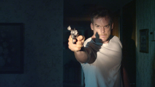
Director Jim Mickle is known for his distinctive horror fare, like the low-budget gentrification-themed rat-zombie picture Mulberry Street, the apocalyptic vampire-hunter movie Stake Land, and last year's American-cannibal film We Are What We Are, which debuted at the 2013 Sundance Film Festival. Mickle made a smooth shift into a different genre with Cold in July, an adaptation of a 1989 Joe R. Lansdale crime novel starring Dexter's Michael C. Hall, Sam Shepard, Don Johnson, and Nick Damici. Cold in July played in competition at this year's Sundance festival and was promptly picked up by IFC Films for a summer release.
A Self-Sufficient Production in Upstate NY
Light Iron's New York offices supported production and post on the film, which shot in upstate Kingston, NY. Cold in July came together quickly last year — Mickle first met Hall at a party at Sundance 2013 — with eligibility for another Sundance debut in mind. "They wanted to shoot everything in 25 days and we knew they were aiming for this Sundance deadline," recalled Light Iron Senior Producer Megan Marquis. "We had to find a way they could be really efficient and get what they needed quickly enough to leave plenty of creative time to make their choices in the editorial room and, especially, when they came in [to Light Iron] for conform and color."
Because the production was so far outside New York City, it had to be completely self-sufficient. Light Iron outfitted the Red Epic shoot with an Outpost mobile laboratory system for downloading data, syncing up dailies, and making LTO backups. Editorial was based in Los Angeles during the shoot, so drives were shipped via FedEx several times a week with ProRes files for editorial. On set, the production used Light Iron's Todailies app for viewing dailies on an iPad. "Jim really fell in love with the iPad dailies concept when he was here," Marquis said. "Jim and his cinematographer, Ryan Samul, could see their work immediately, choose the takes they liked, and relay that to an editorial team across the country."
Meanwhile, RAIDs from the Outpost system as well as the LTO tapes were sent down to Light Iron in New York for safe keeping, while the producers kept tabs on the shoot by looking at web dailies. Once the edit was finished, the project ended up back at Light Iron for conform, and color.
Suggesting Setting With Color Choices
While the Outpost system was central to the production from an organizational standpoint, it didn't get used much for setting looks in the dailies. DI colorist Sean Dunckley realized quickly that Mickle was technically fluent and therefore comfortable with a largely untreated look until it came time for a deeper dive into color. "Jim has a strong VFX background," Dunckley said. "He can envision the process, which isn't the case with a lot of directors. A lot of directors need to see their film when they're cutting, but I think [Mickle and Samul] kept the dailies open so that they could see everything. The dailies didn't give us guidelines as much as they were just more of the conversation."
The DI color process started with generalized conversations about the look of the film that helped home in on any visual challenges that might require some extra during the six-day session. For example, the film is set in East Texas during the late 1980s, and it was important to talk about how to underscore that setting without going overboard or being too literal with the stylization. "We did some color effects to help," Dunckley recalled. "We pushed a little bit of warmth into the blacks and desaturated the highlights, so it would have a little bit of the feel of the films of that time, but we didn't add film grain or push it too far. We just needed a subtle feeling."
References for the film's look included Big Trouble in Little China, among other John Carpenter films, not to mention the 1989 Patrick Swayze film Road House. "A little bit of revenge, a little bit of a thriller, just an 80s kind of movie," Dunckley said. And because the film has a twist partway through, a color treatment helps separate the two segments.
The first part, which deals with the family life of Michael C. Hall's character, is a bit drab and unsaturated. "One of the things we did was to push a little warmth into the blacks in those scenes," Dunckley continued. "That was our 80s throwback. The 80s had a lot of desaturation, but there was a littl ebit of warmth in the blacks, and not as much color separation as in the DIs we see today. And then we desaturated more in the luminance levels so that [the image] rolls off the way film used to roll off. Digital cameras kind of fight hard to keep that saturation, but we desaturated [the image] from the top down."
When the narrative shifts into more of an adventure-story mode, contrast and color separation are pushed more, and more color saturation comes through on screen. "We really pushed it," he said. "The desaturation is turned off, the contrast is pushed more, and colors are selectively saturated."
Skimming from Scene to Scene in the DI
Dunckley said he likes to keep the DI on track in part by moving through the film in a nonlinear fashion, jumping from scene to scene and coloring just a few shots at a time. "By the fourth day, we've come across a scene like four times, filling in gaps the whole time," he explained. "That really helped us get a feel for the subtle changes. When you go through it linearly, by the time you end four days later, you might go back and realize you've forgotten where you started. When you move around, you might get to a scene on the third day and say, 'Well, I really liked where we were at the end, so let's do that on this scene.' So we spent a day and a half just setting looks that way, and then spent the rest of our time filling in the holes. On the final day, we invited the producers to come in and watch down the entire film. Their notes were really subtle — just a little bit of touching up here and there — so it was really great."
As far as any specific shots that needed special attention, Dunckley cited the film's many night-time shots, which had to feel very dark (some shots used no practical light at all) but be completely readable by the audience at the same time. "Ryan used what he called a 'peacock filter' when he was lighting at night," Dunckley said. "We really pushed a kind of cyan blue into the blacks at night. We could have an elevated black level, but it's got a color to it that helps you see into those blacks. It's a delicate process of having just enough so that the audience still thinks it's dark."
Cold in July was shot in 5K but delivered as a 2K DCP, a process that allows the top and bottom of the frame to be repositioned, both during editorial and then again by the cinematographer in the DI theater. And the extra resolution was useful in a handful of shots that exhibited some artifacts in 2K — like moiré when shooting against a brick wall — that could be tamed by going back to the higher-resolution footage.
But the main advantage in the DI was the easy rapport and creative understanding between Mickle and Samul. "This is my first time being part of that team, but Ryan has shot all of Jim's films," Dunckley said. "Their collaborative nature allows them to finish each other's sentences, which is great. And by the end of the day, I could feel right where Ryan and Jim wanted to take shots."
Crafts: Post/Finishing Shooting
Sections: Creativity
Topics: cold in july light iron megan marquis mobile labs outpost sean dunckley
Did you enjoy this article? Sign up to receive the StudioDaily Fix eletter containing the latest stories, including news, videos, interviews, reviews and more.


