Jill Bogdanowicz on Grading the Filmmaker's Latest Multi-Story Creation
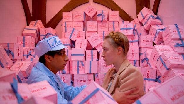
Wes Anderson's The Grand Budapest Hotel is a welcome respite after this long winter: the film's eternal spring pinks and yellows explode on the screen like an overstuffed bag of cake icing. Yet inside this treasure box—with the detailed and finely crafted production design, cinematography and ensemble performances now associated with Anderson's later works—deep, saturated jewel tones abound, not to mention different aspect ratios and palettes consistent with the passing of time. In other words, it was also a feast of sorts for colorist Jill Bogdanowicz, who graded the film on DaVinci Resolve.
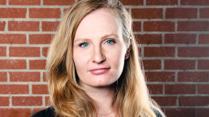
Color science is in Bogdanowicz's blood: her father Mitch Bogdanowicz was a senior research fellow and color scientist at Kodak for more than 30 years and Jill began her career at Kodak Cinesite before moving to Technicolor and, in 2012, to her current post at Modern Videofilm. We asked her about her working relationship with Anderson, the rich tapestry of references they shared and how the gradations of color and saturations evolved during the DI alongside the director.
StudioDaily: Is this the first time you've worked with Wes Anderson?
Jill Bogdanowicz: It is my first full-length feature with Wes but I actually did work at the end of Moonrise Kingdom on a few sequences. At the time, I worked at Technicolor and the DI was being done in New York and Wes happened to be in L.A. We had a system at Technicolor where you could run what was happening during the DI live in L.A. and I was running the L.A. side. Wes and I discovered that we got along really well and it was easier for me just to take over the film's last few sequences and color-grade in the new visual effects that had been dropped in with Wes in the room, so he didn't have to deal with being on the phone. We worked really well together and so he sought me out for this film.
It must be a dream come true as a colorist to work for such a visual stylist as Wes Anderson. How did the two of you first discuss the palette for the film and build out the grade from there?
It absolutely is a dream come true—and it was really fun, too. I went to London four times to work with Wes, beginning in June last year. I worked concurrently in LA on the film but we found that we got a lot done in the grading suite together. Before I first went to London, we had been exchanging emails back and forth and he had been sending me photo references of old late 19th century and early 20th century Photochrom looks from the Library of Congress. [Hint: look up "photochrom" on Wiki and one could hazard a guess where the first inspiration for Anderson's fairy tale hotel came from.] He was clear that these were a starting point for the look he wanted for certain sections of the film. There were small pieces of the movie where he wanted a very specific look pertaining to photochrom, but we also did a lot of back and forth about other references. I did a lot of research on photochrom and actually worked with my father, who had worked as one of the lead color scientists at Kodak for most of his career, to develop a photochrom 3D LUT we could use for the film.
Did Anderson know about your father's work?
Wes didn't know my father and I suggested it. My father is very good at developing these kind of specific LUTs for various film stocks and different processes, so he was able to build several different flavors of photochrom looks and create these really interesting 3D LUTs. So I brought those to London with me and we experimented with all types of looks—some pretty extreme and others less so. All of it gave Wes a great idea of the scope of what we could do with the LUTs but also what we could do with the DaVinci Resolve. We ended up going for more of a subtle photochrom look during the opening scene of the girl in the cemetery with the book, though we did experiment with a lot more intense versions.
Were you working with a full Resolve setup in London during these sessions?
I graded the film on Resolve v9, since I started it in 2013. We kept it the same version throughout. I had my full-blown control panels and setup in London. We brought everything over from L.A. with us. Moonrise Kingdom, by the way, was mostly done on the Lustre but the final sequences I did were also on the Resolve.
Can you talk a bit more about how color and also different aspect ratios define the three different time periods depicted in the film: the 1930s, the 1960s and the 1980s?
Wes had the idea from the start to frame the different sections of the film uniquely to let the audience know what time period they are in, and to shoot it all on film, with a 1.37 ratio for the 1930s, a 1.85 ratio—the current theatrical projection standard—for the 1980s and a 2.35:1 anamorphic ratio to signify the late 1960s. But his idea for the palette within those sections evolved more during the grade. His original idea was that the 1930s section would be a little bit faded and desaturated looking and the 1960s more bold, with rich yellows, golds and greens. And then in the 1980s we'd step back to a little more of a neutral palette that wasn't saturated or denatured in any specific way. But starting with the beautiful production and costume design, we decided in the end to give the 1930s scenes a much brighter, saturated look.
Would Anderson do or say anything in particular when you were getting close to a final look? And what about feedback from the rest of the filmmaking team?
He's a pretty introspective guy, so if he didn't say anything or if he wasn't squirming in his seat, then I knew he was happy! Editor Barney Pilling was also very present during our London sessions. The DP, Robert Yeoman, was working in New York during those London sessions, so I never actually got to sit down with him. But Wes screened with him before we completed the project and got a few small notes from him. It was shot so beautifully and the production design so intricate that it was such a treat for me to be able to work with all of that material during the DI.
How much of the color was in-camera and how much was finessed during the grade?
Everything was finessed, definitely, but Wes had everything designed in a way so that it could be retained during the grade. In finding our different looks, we were very aware of the color palette chosen by production design. In the hotel, the walls are really pale pink and the red rugs are very strong and the hotel staff is wearing brilliant, deep purple outfits. We wanted to be sure those things retained their richness. In some places they are enhanced and in others there are certain details we could pull out, like making a lightbulb brighter or darkening down certain parts of the frame. We did quite a bit of that kind of refining without blatantly changing the colors of his production design. Sometimes I do get to talk to the production designers on a project, but this time, due to geographic location and timing, it was more important to get in the suite with Wes himself.
Especially since all of it begins in his head.
Exactly. He is utterly amazing—the amount of detail that he can hold in his mind and how clear he is about his vision is quite remarkable.
Do you have a favorite scene in the film?
For me, the first 10 to 15 minutes of the movie encompasses all the different aspect ratios and all the different looks that get you into the story. Ralph Fiennes' and Jeff Goldblum's performances were both so wonderful. But the scene when the cat gets thrown out the window gets me every time. Seriously, every character in this film is so interesting and quirky. I can't even count how many times I've watched it and I'm still not sick of it. It's all the little details that Wes put in to this movie; they reward repeat viewings.
There's even a black-and-white segment in the film. Was that shot in color and created in the DI?
Yes; I converted it and added grain to make it feel even grainier than the original film stock was.
What were some of the more challenging scenes to grade, and how did Resolve help you navigate them?
We actually did several day-for-night, or rather day-for-dusk, looks and one of the tools on the Resolve that helped me get there was tracking. The tracking in general on the Resolve is pretty great, so if I brightened a face and darkened the sky, I was able to track everything seamlessly and I could really feel what I was doing with power windows. The fact that I could easily incorporate alpha-channel maps from the visual effects companies was also very important. There were several scenes where it was not only the color-correction from the Resolve but the ability for the visual effects team to do work and then hand me the alpha channel so I could further refine what they've done color wise. Being able to layer on without the machine slowing down was huge. For example, in one shot I could have four or five alpha-channel maps, along with many power windows tracking at the same. That was really impressive, but it was needed — especially with Wes in the room. He has a really clear idea of what he wants to see, and it was important that he have a good cognitive flow during the DI. To stop and render something would have put a real hitch in the works. I know he was happy that he didn't have to wait for anything and with the speed at which we were able to work.
When did you finish?
We were working right up until the release. It wasn't consistent working, but my last trip to London was right before Christmas so we could review the film in its entirety with the later visual effects cut in. There were certain scenes that once we looked at the visual effects in place they changed the direction he wanted to go, but in general, once he decided what something was, it stayed that way and he didn't revisit it later. He was very clear about his decisions.
I understand you also just finished grading the new Veronica Mars film, which was initially revived after its cancelled TV run via Kickstarter.
We went for a little bit more of an edgy look for the movie vs. the original TV show, to keep it current with evolving looks. It's a little darker and more mysterious at times; the original was more poppy. But for theatrical, we were able to go edgier enough to make it interesting. I just got a ping from the cinematographer today, who was thrilled with how it looked at the premiere. It came out really great.
Crafts: Post/Finishing
Sections: Creativity
Topics: Blackmagic DaVinci Resolve Jill Bogdanowicz Veronica Mars wes anderson
Did you enjoy this article? Sign up to receive the StudioDaily Fix eletter containing the latest stories, including news, videos, interviews, reviews and more.
