Graphic Design with Gravitas on a Documentary Budget
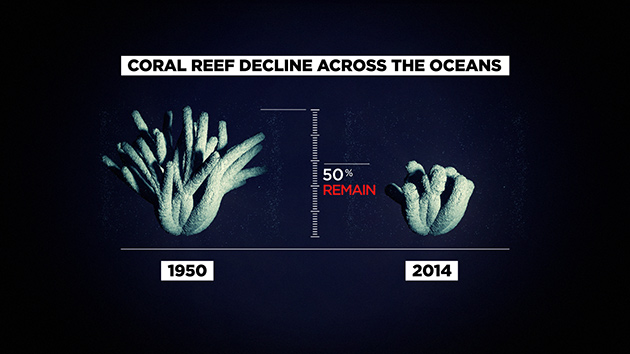
For decades, renowned oceanographer Sylvia Earle has been sounding the alarm—the Earth’s oceans are dying and we need to protect them, not just for ecological reasons but for our own survival. Her lifelong work is the subject of Mission Blue, a documentary co-directed by Fisher Stevens and Robert Nixon that explores how things like overfishing, oil spills, garbage dumping and polluted runoff have ravaged the ocean over time.
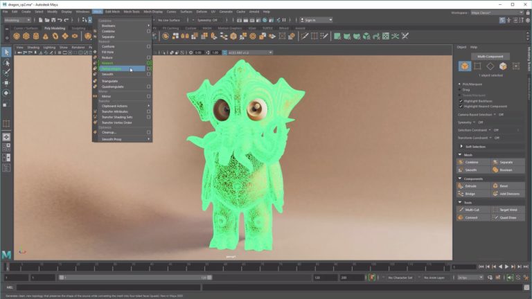
In addition to live and historical footage and photographs, the film includes a number of graphic elements created by artists at the New York offices of the creative studio Framestore, which also did the main title sequence and end credits. Creative Director Marc Smith led the team of artists using Maxon Cinema 4D, Autodesk Maya, Adobe After Effects, Autodesk Flame and The Foundry Nuke to help convey the film’s urgent message.
“All of us felt very passionate about working on this documentary,” Smith recalls. “Everyone brought so much of themselves to the project, and it was great to be able to use our skill sets to broaden people’s awareness about something so important.”
Though Framestore is best known for creating VFX for blockbusters like Gravity and Guardians of the Galaxy, Smith says the studio is being tapped more and more often by documentary filmmakers seeking higher production value. While doc makers generally have less money to work with than agencies and studios, the tools available to today’s artists make it easier to quickly produce high-quality graphics and VFX. “Documentarians are surprised by how we can turn things around to meet leaner budgets, but the integration between Cinema 4D and Adobe Creative Suite make it possible for us to turn things around very quickly,” Smith says.
Things that didn’t get finished during the workday were done by Smith and others who volunteered to work nights and weekends. “This was a project we really believed in and we know that infographics and VFX can make documentaries more compelling,” he says. “We all put so much into it to make it something everyone could be proud of.”
Visualizing the Numbers
After showing Stevens and Nixon a range of style frames, Smith quickly gained the directors’ trust, giving Framestore a vast amount of creative freedom. Many of the graphics share the same clean, informative look, but Smith also gave them a dark quality in keeping with the gravity of the information being conveyed.
Because most of the graphics involved illustrating statistics cited in the film, the production team worked closely with Stevens to verify facts and figures. The harder a stat was to quantify, the trickier it was to execute, Smith says. “It was fairly straightforward to show how the incredible population growth in Florida has had a tremendous impact on fisheries and the local environment. But it’s difficult to say for certain how many tuna, sharks or octopus are in the ocean now versus in 1950, so we could only make educated estimates based on what we do know, such as the latest fishing hauls versus previous years.”
Framestore merged several different ideas to get the flat, stylized look of the overfishing graphics. “After some experimentation, we felt a planar, flat infographic look worked best in illustrating these statistics, including reducing the water down to a low-polygon feel,” Smith says. After modeling the fish shapes in C4D, the team experimented with ways to stack them. Next, they came up with the idea to create simple nets to surround the fish and help make clear the point that they are being pulled out of the ocean. “We learned a lot while working on this documentary, like the fact that it used to be common to pull out full-grown tuna around 15 years old,” he adds. “Now, because of overfishing, you rarely find ones that are older than two, which means they often don’t even reach reproductive age, giving the species a tough chance at survival.”
Credits:
Senior Design Director/Animator Marc Smith
Animators:
Jonny Likens
Andy Rowen-Robinson
Shayne Ryan
Raul Ortega
Hieu Phan
Producer: Leah Garner
Moving the Story Forward
Framestore relied entirely on Cinema 4D to illustrate the film’s most jarring statistic, the increase in oil rigs in the Gulf of Mexico from one in 1947 to 33,000 today. Terraced, topographical layers give way to water created using the Houdini Ocean Toolkit. As the camera moves out past the first oil rig, the rest are shown as black dots virtually covering the surface of the sea. “We based our model on a map we received showing where the rigs are in the Gulf, and then we used a cloner object to grow and populate them,” Smith explains.
A rig is seen in close-up in the 1947 shot, which depicts the rig itself as a kind of mechanized blob of oil. “We had a lot of fun working on the materials for this, and we wanted this image to look more textural than the others,” Smith says, explaining that the team first created a model of an oil rig and then toyed around with bump maps to come up with the effect of oil growing out of it.
“We strongly referenced oil-in-water imagery to illustrate two elements that do not belong together,” Smith recalls. Following the modeling stage, they experimented with techniques such as subsurface scattering in the texturing phase to achieve a more tactile appearance. “Then we used shot elements, plates of oil, in the compositing stage, adding small details such as the rainbow prisms present when oil and water collide.”
To show how agricultural practices in the heart of the country affect the water off the Gulf of Mexico, Framestore created a dramatic, map-based graphic. Bright red lines make clear how millions of gallons of runoff move via rainwater, rivers and through the soil straight toward the Gulf. Once there, chemicals including nitrogen suffocate fish and upset the chemical balance of the water. Cloners and tracer lines built with C4D's Thinking Particles set-ups were used to achieve a “sinister, tendril-like look,” Smith says.
Also sinister was the team’s depiction of dead zones—areas of the ocean where life no longer exists because of factors such as pollution and oxygen concentrations that are so low that animal life suffocates and dies. Each spring, agricultural runoff creates on of the largest dead zones off the Gulf of Mexico. But there are dead zones all over the world, which Smith’s team highlighted by showing the globe at night.
Smith and his team illustrated approximately 500 dead zones of varying sizes, which started out as models in C4D. Files were then migrated to Maya to take advantage of available in-house talent and render resources. “These scenes were a combination of large, animated texture plates created with a combination of Houdini and After Effects, with the cameras and animation being built in Maya and the final renders output from Arnold,” Smith says.
These were then composited using a combination of Nuke and Flame, with a final grade and decals applied in After Effects. “These were some of the final shots we delivered in a very tight turnaround time, and it was all hands on deck at this stage,” he says. “Having the ability to combine a vast array of tools and animation talent was key to getting the project across the line. We built, animated and output as many as 11 of these shots within the course of one weekend, a testament to the dedication, skill and enthusiasm of the staff onboard.”
While many of the graphics they created were dark, Smith says that he and his team were inspired by Mission Blue’s message, which was both dire and a call to action. “By the end of the film you feel educated about the issue and you want to do what you can to help,” he says. “Sylvia Earle’s organization, Mission Blue, has been working hard to set up protected areas in the ocean called Hope Spots, and people can help support her mission.”
Meleah Maynard is a Minneapolis-based writer and editor.
Did you enjoy this article? Sign up to receive the StudioDaily Fix eletter containing the latest stories, including news, videos, interviews, reviews and more.


