All About the Six-Week F65/F55 Shoot, Including Lensing and Lighting Choices and VFX Challenges
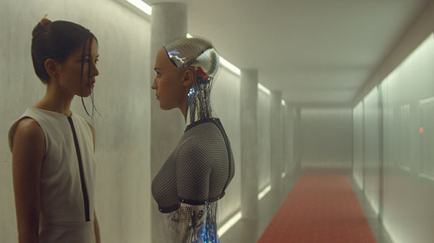
Mini distributor A24 broke new ground this weekend, earning a company-record $5.44 million from the semi-wide release (under 1,300 theaters) of the new science-fiction drama Ex Machina. The directorial debut of Alex Garland, well-known for screenplays including 28 Days Later, Sunshine, and Never Let Me Go, Ex Machina is the story of a Silicon Valley billionaire (Oscar Isaac) playing god by creating a sexy but low-key female robot (Alicia Vikander) who may have a mind of her own; Domhnall Gleeson portrays the lowly programmer recruited to judge whether she is truly sentient. Watch the featurette, below, to get oriented on specific challenges of the shoot, then read our round-up of what else we know about production, post and VFX work on the film, drawn from sources around the web.
What's the Big Idea?
Director Alex Garland says the concept came to him while he was in pre-production on Dredd (as screenwriter) and reading Murray Shanahan's tome Embodiment and the Inner Life: Cognition and Consciousness in the Space of Possible Minds. Other influences cited by Garland include Machine Language for Beginners by Richard Mansfield, The Emperor's New Mind by Roger Penrose, Philosophical Investigations by Ludwig Wittgenstein, and The Singularity is Near by Ray Kurzweil, as well as the films 2001: A Space Odyssey and Altered States. Source: Esquire, Reddit AMA.

Alicia Vikander on set with director Alex Garland. Photos courtesy A24 Films.
Production Specs
Ex Machina was shot in the summer of 2013 for four weeks on the B and D Stages at Pinewood Studios and for another two on location in Norway, where the production found the Juvet Landscape Hotel. Footage was shot with the Sony F65 and, for handheld work, F55 and recorded to 4K raw. At Pinewood, DIT Jay Patel told Definition Magazine, his 12-core Mac Tower handled playback "almost at real time." Source: The Credits, Definition Magazine, Pinewood Studios, Vanity Fair.

Director Alex Garland and star Oscar Isaac in the film's laboratory set, with the 3D-printed robot skeleton derived from the CG model created for Ava.
Lenses and Lighting
Interestingly, the high-res 4K look was partially countered by DP Rob Hardy's use of vintage lenses — mainly, the Cooke Xtal Express series, with glass that dates to the 1930s but was famously modified by Joe Dunton for anamorphic shooting in the 1980s. In fact, Hardy later said he chose Sony's F65 (over competing cameras from Red and ARRI) in part because it was sensitive enough to pick up specific aberrations in the "ridiculously insane" glass he had selected. The set for the location where the majority of the film takes place — the highly isolated home of a billionaire tech entrepreneur and inventor — was originally designed to be lit by Kino Flos, but Hardy was skeptical of the apparently simple equivalence of flourescent lighting with a sci-fi environment. Instead, he wanted more control. He ended up having 15,000 tiny pea bulbs embedded in the sets for a dramatic increase in the tunability of the lighting for individual scenes. "I became unpopular very quickly," he joked in a recorded conversation with fellow cinematographer Barry Ackroyd, BSC. "You can have so much control, but it's degrees of control. It's not on or off, or dim down [the light]. I could gradate environments, and do it very quickly." Source: BSC Ex Machina Q&A on Vimeo.

Portraying an Artifical Intelligence
For actress Alicia Vikander, the role was singular—but not in the way you might expect of a glossy science-fiction film. For one thing, the script was written as a character-driven psychological drama and the film would include long conversations featuring Vikander and her co-star Domhnall Gleeson. "Most of the scenes between us were 10 or 12 pages long — it's rare to find a scene that long in any script," Vikander told Indiewire. As far as her performance as a robot, Vikander said she was in some ways given free rein by director Alex Garland. "He said, 'I'm just going to sit here in a corner and you try whatever you want. So I did that and it was interesting. I realized when I aimed for that physical perfection, the way it just moved, that in a way made her more robotic. Because what is human is flaws and inconsistency. So I gave her some off beats. I wanted her to be a girl, but I also wanted her to have some glitches." Source: Indiewire.

Ava's Body
More than 300 robot shots were delivered under the direction of Double Negative's Andrew Whitehurst, who was VFX supervisor for the production, according to Cinefex. Shots were generally around eight seconds in length, with the longest shot of Vikander in the film running for more than a full minute. That, along with the above-mentioned use of vintage glass and its attendant distortions, made tracking a special challenge. Scenes featuring Ava were photographed normally on set, with no green-screen photography at all. After each shot, VFX captured clean plates with the main camera as well as HDR lighting reference. Vikander's face and hands were roto'd in every shot, sometimes along with her shoulders, feet, and/or lower torso. Pixar RenderMan was used to render robot Ava's body as a mesh generated using camera- and body-tracking data (and the HDR light) from set. The 2D compositing team finished the shots. Source: Cinefex.

Ava's brain is wetware—it's manufactured technology that's near-biological in nature.
Ava's Brain
With a brief to use jellyfish as reference material, Milk designed AVA's CG brain. The team, led by VFX Producer Nick Drew and VFX Supervisor Sara Bennett, used a procedural Houdini build in order to quickly create new iterations during the look-dev process. Starting with a sculpted mesh, artists added "frills, tentacles, pores, antennas, wireframe cages and air bubbles," all of them set in motion using noise-driven animation rather than full-on simulation. The finished asset was exported from Houdini to Autodesk Maya for rendering via Arnold before the final composite was made using The Foundry Nuke. Source: milk-vfx.com
Editorial
Editor Mark Day worked out of Pinewood Studios, cutting on Avid Media Composer with First Assistant Editor Hermione Byrt and Assistant Editor Erline O'Donovan. Effects that came in handy in the Avid included Resize, Spectramatte, Timewarp, Reverse motion and 3D Warp. Visual Effects Editor Tina Richardson comped in shots as the editing proceeded and the film's live-action and CG elements came together seamlessly. Source: Televisual, via Avid Blogs.
Crafts: Editing Shooting VFX/Animation
Sections: Technology
Topics: Project/Case study alex garland Alicia Vikander Andrew Whitehurst arnold autodesk Avid double negative erline o'donovan hermione byrt Houdini mark day maya media composer milk Nuke Rob Hardy side effects software studiodaily dossier The Foundry tina richardson
Did you enjoy this article? Sign up to receive the StudioDaily Fix eletter containing the latest stories, including news, videos, interviews, reviews and more.


In some ways, this sounds like a movie I watched recently on Netflix – “The Machine.” It was directed by Caradog James and starred Toby Stephens and Caity Lotz, and was a decent film. The robot/android was also named Eva, I believe, and her goal was to prove her own consciousness. I’d like to see this new one, and see what the old glass does to the shoots.
This movie, a genre popcorn exploitation thriller, has received unanimous gushing that buys its wholesale the college dorm lounge speculative debates at the center. But that anamorphic glass is a huge visual character in this film’s extraordinary flaws. You’d think that the camera operators ate a bag of potato chips and smeared the lenses recklessly, while the pretentiousness of using them (with all their “vintage” flaws) is the equivalent of hiring last decade’s hipsters, facial hair and ironic thrift shop wardrobes.
Please support your arguments instead of just ragging on the film. How did the use of vintage glass detract from the scenes? Why don’t you find it interesting and toss it to the “college lounges.” Great way to support your website.
Gosh, this is an old one.
“Support your website?” I’m not scheming and corporate, just freely expressing. Though, I do note that almost all the cinematography tech blogs are extremely diplomatic to the point of basically reprinting corporate press releases, grabbing drinks together at trade shows and praying that they’ll keep getting free toys to test.
“Support your arguments?” All up there already, if you didn’t care to see. Mainly, it’s the theme that wannabe “auteur-driven” cinematography more than ever today veers off into distrust of audience intelligence, believing that visual damage (e.g., shaky camera, hazy lenses, anamorphic flaws/flares) draws us into a world, even though we are very comfortable navigating with our imaginations and not getting aesthetically yelled at, thank-you-very-much. Films like this are the equivalent of that budding alpha-male in the front row of third-grade science class, waving to get the teacher’s attention with an insight that will change the world by the end of the semester. The rest of us roll our eyes. Outside that classroom, hordes of gullible consumers (for the rest of that kid’s life) can always be found, easy to attract with the right cheap tricks (e.g., in the case of Ex Machina, comic-book erotica for boys).
So in short… you don’t like the movie?