Spot Celebrates 50th Anniversary of Iconic Sneaker Maker
Barton Damer’s design and motion graphics studio, Already Been Chewed (ABC), is known for creating edgy, innovative work that artfully connects brands like Nike, Nixon, Street League Skateboarding and Facebook with popular culture. Recently, ABC worked with Vans—maker of shoes and apparel loved by skateboarders and surfers—on a project celebrating the 50th anniversary of the Vans Pro Classic “Era” shoe.
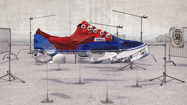
In addition to using Cinema 4D and 3D-Coat to create a fully animated 3D spot, ABC designed artwork for print, as well as window and point-of-purchase (POP) displays in all of the Vans retail stores. The magical spot offers a visual timeline depicting the history of Vans, starting with the original Pro Classics Era shoe and moving through objects that show the passage of time to reveal an anamorphic image of the current Era shoe.

This C4D screen shot makes clear how far objects needed to be spread out in Z-space to create the anamorphic artwork.
An anamorphic image is one that looks correct only when viewed from a particular perspective or through an optical device, like a mirror (or, in the case of anamorphic cinematography, a distorting lens that "squeezes" or "stretches" a picture for widescreen acquisition or projection). Vans offered up this approach in their creative brief, asking ABC to design something that would look jumbled when viewed from one perspective but right from another. “They wanted us to come up with a unique way of showing off features of the shoe without doing a typical exploded view,” Damer explains.
It was a cool idea, but making the shoe the focus seemed problematic because it only has about four pieces for a split view — outsole, midsole, upper and laces. ABC and the Vans creative team figured that even an anamorphic approach would wind up looking like an exploded view. So they came up with the historical timeline idea where objects along the timeline — skateboard wheels and ramps, a skateboard, shoe parts, cameras for filming skateboard videos — come together to make up the shoe itself when viewed from the right angle.

To create the anamorphic image, every object was modeled in C4D or provided by Vans and connected with string and C-stands.
Though ABC had done some anamorphic work in the past, this was the first time they had animated that kind of approach. They started by doing a test render to prove that they could do it. “We used a bunch of random 3D models that we pulled out of Cinema 4D’s content browser, and we ripped textures off of them and formed a triangle using that technique to show that we would be able to execute everything we said we could,” Damer recalls.
The concept worked, and the team appreciated how doing everything in CG offered them the opportunity to explore a variety of ways to make up the shoe and how it would look in the final view. “We didn’t want it to look too obscure in the final,” he says, “but we also didn’t want it to look too perfect, like we just did it in Photoshop. So we purposely made slightly imperfect lines and edges so the effect would resonate and not look like cut out pieces in Photoshop.”

Already Been Chewed’s anamorphic image was also used in anniversary-related print promotions.
With the exception of actual Vans shoes, all of the objects that come together to make up the final anamorphic image were modeled in Cinema 4D or obtained from Vans, which has a library of 3D models of their shoes. With gravity in mind, ABC’s team connected the objects together in 3D space with string and stands as if they were building the actual piece on set. Next, they looked at the scene artistically to make sure things weren’t too crowded.
“We had a lot of C-stands in there at first, which looked cool but took away from the project, so we pulled those out and added more strings,” Damer explains, adding that their goal was to figure out what read as a shoe first and as one of the objects that made up the shoe second. “In some of our takes, the artwork looked like a pile of stuff rather than an actual shoe until you looked really closely. Marketing wanted the shoe to read much faster, so that’s the approach we took.”

Artwork for Vans stores was created as 3D layers and printed so displays could be constructed with four layers of objects.
To figure out where to place the various objects, Damer used Illustrator to trace around the space that made up the entire shoe, as well as the various sections where certain colors were needed such as the sole, main area, toecap and heel. Next, he brought those paths into C4D and used them as a template. “I locked off my camera and locked off those paths so they wouldn’t move around, and then I knew where to put things,” he recalls, explaining that the key to creating artwork like this is using Z-space — depth rather than width and height.
Damer explains: “Everything needed to stay the same scale for this, so if I needed something to fill up more space, I couldn’t just scale it up. I had to get it to come closer to fill the space or go further away to be smaller.” In the final project, the shoe is the correct size compared to the skateboard, and the skateboard fits on the ramp. To give the spot a lo-fi vibe in keeping with the Vans brand, ABC rendered at 10 frames per second rather than 30. The effect rendered quickly and gave the spot a somewhat stop-motion vibe.

ABC modeled skateboard wheels and rotated them 90 degrees to create laces.
Texturing was done by ABC artist Thomas King, who used 3D-Coat to make all of the objects look as if they had been spray-painted. Using a normal map and a reflection map, he was able to make some areas appear glossy, like the paint was still wet and bumpy. “That was key for this project, because early on we decided we wanted to spray-paint everything to be the colors we wanted,” says Damer. “We thought that would give the shoes a more grungy, Vans vibe rather being all slick and polished in 3D.”
Opting to use very shallow depth of field also helped complete the look, Damer says. “That was all rendered right out of C4D using physical render, and the camera options keep things looking really nice, clean and as accurate as possible.” ABC’s lead animator, Bryan Talkish, animated all of the objects so they would swing back and forth and land in the proper position as the camera moved through the scene.
Since creating the spot and related materials, Damer stopped into a local Vans store to ask about the window display. “I was going to ask if I could have it when they were done with it and the manager said it had gotten a ton of comments from customers saying how cool it is,” he recalls. She said it was her favorite display for Vans.”
Meleah Maynard is a writer and editor in Minneapolis, Minnesota.
Crafts: VFX/Animation
Sections: Creativity
Did you enjoy this article? Sign up to receive the StudioDaily Fix eletter containing the latest stories, including news, videos, interviews, reviews and more.


Leave a Reply