Crafting Visuals for Director Gore Verbinski's Horror-Thriller Was “Challenging,” “Intense,” and “Never Simple”
Bojan Bazelli, ASC, enjoyed his reunion with director Gore Verbinski — their third collaboration together — on the director’s newest visual-fest, A Cure For Wellness, even though he readily admits it was one of the most creatively and technically challenging projects of his career. The psycho-horror thriller tells the story of a young executive (Dane DeHaan) who is sent to a mysterious “wellness center” deep in the heart of the Swiss Alps to bring home his company’s CEO. There, he learns, to his great surprise, that a rumor that the place makes people feel so good that they “never want to leave” is literally too true for his mental and physical well being, thanks to mysterious “treatments” perpetuated on those who visit by the sanitarium’s director (Jason Isaacs).
The movie has received wide-ranging reactions due partly to the intense and unusual nature of the horror and mystery elements, but the unique visual style of the picture speaks to the creative efforts of Verbinski and Bazelli in partnership with their colleagues. Bazelli reminds that the movie is their second horror picture together after 2002’s The Ring, prompting them to pay subtle homage to that film in a couple of places in their new effort.
During his recent conversation with StudioDaily for the Podcasts from the Front Lines series, Bazelli emphasized that the movie “does not have a simple shot in it.” But the rigors of shooting the movie at a long-abandoned hospital facility in Germany called Beelitz-Heilstätten, where Hitler and other notorious figures were supposedly treated for ailments between World War I and World War II, though intense, made the cinematographer feel “so creatively challenged that I felt bound to overcome every obstacle. I [never felt] those boundaries were strong enough to stop us.”
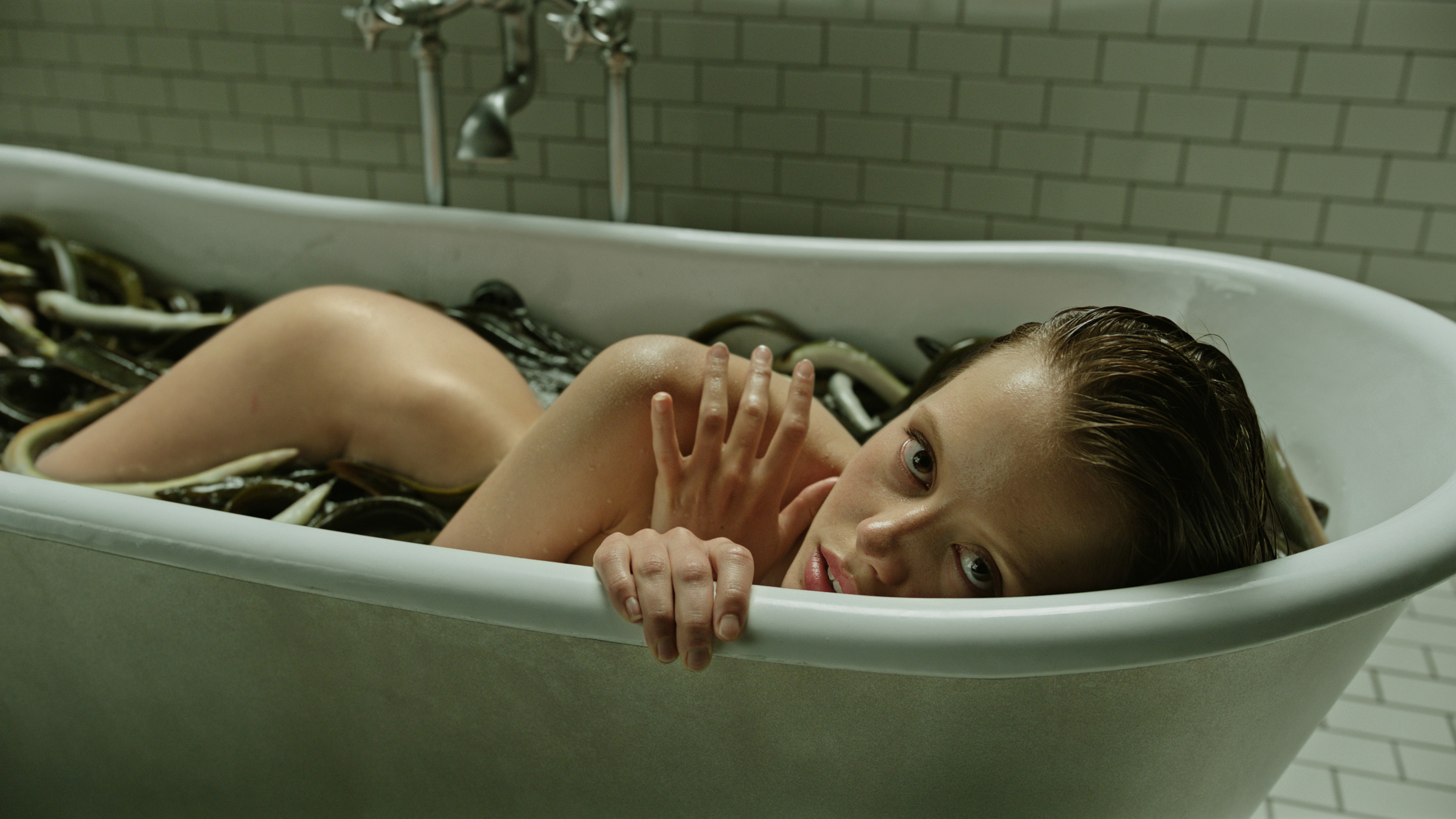
The end result is a motion picture primarily shot with natural light, replete with a quirky aqua-green/yellow color palette, and a wide range of surprising horror sequences ranging from a tranquil woman in a bathtub filled with snakes (actually eels) to long dim corridors through the facility, humans encased in water tanks and so much more. But one of the most unusual moves was the decision to shoot the movie in an obscure aspect ratio — 1.66:1. Bazelli says there were both “emotional” and “pragmatic” reasons for that choice.
Audio-only version:
Subscribe: Apple Podcasts | RSS
The end result is a motion picture primarily shot with natural light, replete with a quirky aqua-green/yellow color palette, and a wide range of surprising horror sequences ranging from a tranquil woman in a bathtub filled with snakes (actually eels) to long dim corridors through the facility, humans encased in water tanks and so much more. But one of the most unusual moves was the decision to shoot the movie in an obscure aspect ratio — 1.66:1. Bazelli says there were both “emotional” and “pragmatic” reasons for that choice.
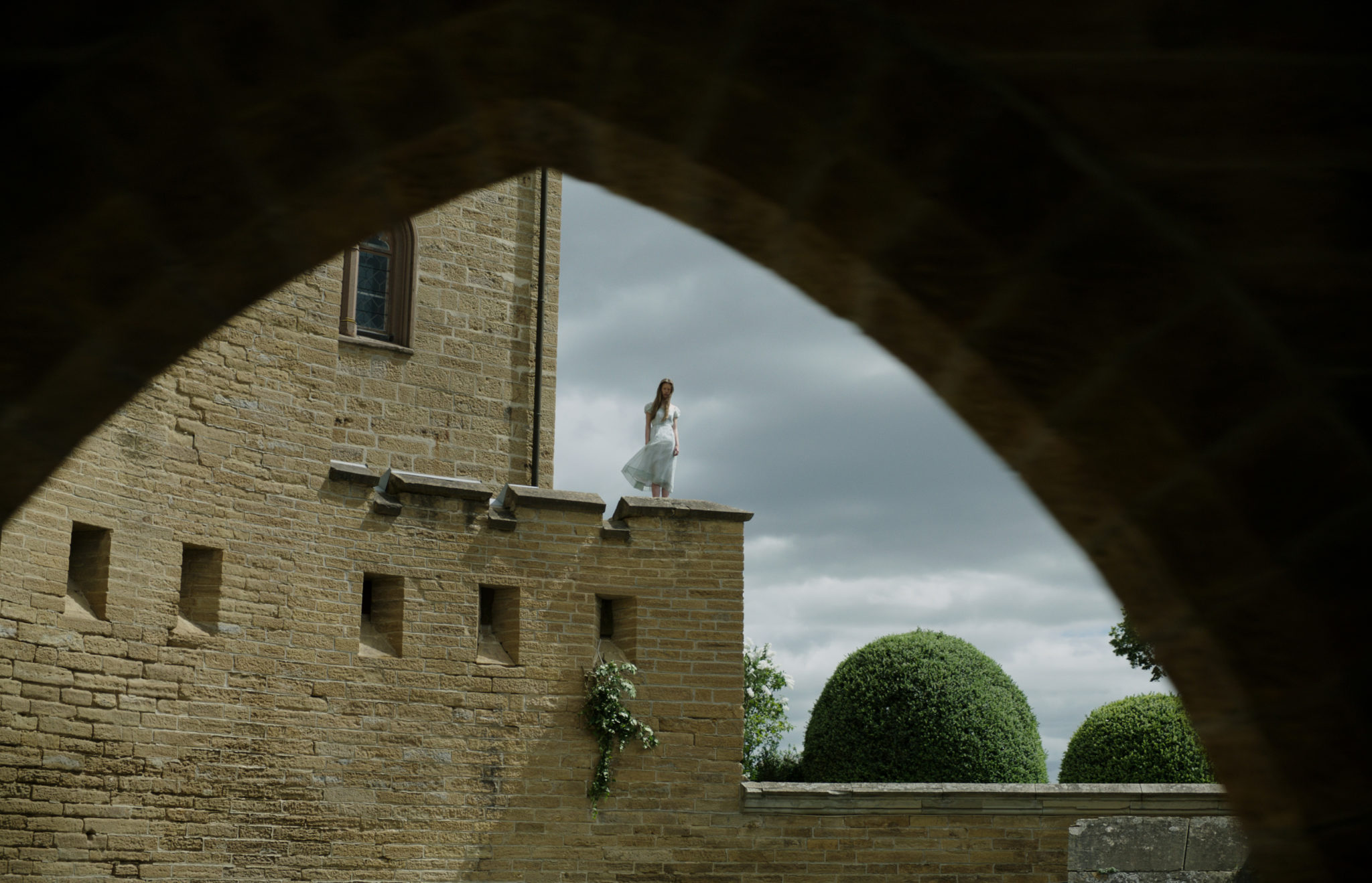
“The [emotional] reason came from the locations [in the Swiss Alps],” he says. “There are verticals in the frames in this movie — the locations are tall, giant, in terms of height. We didn’t want to chop some of that away. At Beelitz, not showing the top of that building, a peak that is sort of Gothic, and scary or dangerous looking — jeopardizing that frame, or going wide to comprehend that in a frame, we would have had to gain so much negative space or unwanted space on the right side or bottom of the frame that we didn’t need. We felt we would diminish our location if we went to 2.40:1 and it would look very strange.
“On the pragmatic side, we thought about what happens after the movie goes on to TV and rentals. Not every [distributor] would honor the frame lines once we gave them the full, uncropped version, in terms of what works best for their system. [We] took into account that in six months from now, you will turn on the TV and see that composition totally cropped, butchering the creative part if they take out a main element, and location is a main element. So, to protect that, we basically went to an almost typical TV format, 16×9, which is slightly smaller than we shot. But in terms of being cropped, it would only be a few pixel lines, which would not have that much effect on the final outcome of the composition.”
Crafts: Shooting
Sections: Creativity
Topics: Podcasts from the Front Lines bojan bazelli Cinematography
Did you enjoy this article? Sign up to receive the StudioDaily Fix eletter containing the latest stories, including news, videos, interviews, reviews and more.



Leave a Reply