A DP of music videos in his native Sweden during the 1990s, Linus Sandgren, FSF, now mostly shoots Hollywood features and the occasional palate-cleansing commercial. In the five short years since he fully transitioned to features, he’s worked with an enviable list of directors that includes Gus Van Sant, David O. Russell, Damien Chazelle and fellow countryman Lasse Hallström. Last year he won an Oscar for capturing Chazelle’s La La Land, and he is currently in pre-production on the director’s next film, a Neil Armstrong biopic starring Ryan Gosling. In between, he shot Hallström’s live-action Nutcracker and the Four Realms for Disney. Both films are slated for a 2018 release.
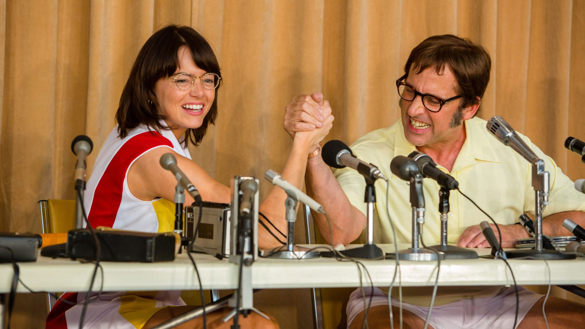
Sandgren’s latest camera work can be seen in Battle of the Sexes, a layered look at the public and private battles surrounding the televised 1973 tennis and gender-sparring match between Billie Jean King and Bobby Riggs. Directed by married team Jonathan Dayton and Valerie Faris (Little Miss Sunshine, Ruby Spark), the film’s centerpiece is a Vegas-style sporting event that pitted the world’s number one female player against a middle-aged former champion and self-professed huckster intent on raising the game’s profile by goading a reluctant feminist into the ring. Behind the scenes, King was also coming to terms with her sexuality and mounting a long overdue battle — that’s still ongoing — for pay equity between male and female athletes.
We asked Sandgren about how he approached this project and how he worked with Dayton and Faris to capture an indelible moment in time.

Emma Stone and DP Linus Sandgren on set.
Photo by Melinda Sue Gordon/courtesy Twentieth Century Fox Film Corporation
StudioDaily: You’ve had the good fortune to shoot some really eye-popping palettes in your most recent films, from American Hustle to La La Land. Is that by design?
Linus Sandgren: In general I really love working with colors, and they don’t have to be saturated. They could be very muted colors but I still care a lot about the warm shifts of hues between colors. And in this case, it was nice because I worked with the costume designer Mary Zophres on La La Land. And I’d worked with production designer Judy Becker on the two David O. Russell movies American Hustle and Joy. We all already had established a relationship. But what I felt was most important for this project to capture the intended look and feel, which Valerie and Jonathan were also very keen to do, was shoot on film. We did some tests between 16mm and 35mm, but film simply captures colors better and richer. You don’t need to add color in post and make it more colorful later; you start with the production and costume design, and it captures what exists and makes them all a little more enhanced or magical, depending on how you treat the film stock. You can push-process, like we did on this one, to make even more contrasts with the colors. To go a little more grainy and colorful just naturally fell into place for this film set in the 1970s.
But not a museum piece.
Not at all. It seems like for every project it’s also important to look at what the script asks for and what the vision of the directors is for that script. In this case, Jonathan and Valerie were very keen to make a picture that looked like it was made in the 1970s, not just looking back at that time. Even with costumes and production design, it was all about doing a contemporary movie in the 70s, rather than looking from afar at all those funny things from that time.
How did your choice of equipment, and style, get you to that place?
All of our rules came from how we would have done it if we were ’70s filmmakers. We tried to put ourselves in that world. So then, I immediately thought, we’re going to be primarily using zooms and warm primes. Anything that flares is going to be warm, like what Gordon Willis was doing, or even Woody Allen films from that period. Because there were so many sides to the characters in this film — they all had a secret, private side and a brighter public persona. We felt that we wanted to work with the camera like it was an emotional eye. We wanted to react and be careful where we put the camera so we could respect these different moods of these characters as they experienced them. In American Hustle, for example, we thought of the camera as an inquisitive kid that just wants to know everything, especially from all these hustlers that are lying to each other and themselves. You want to get right up into their faces and look them in the eyes to see if you can figure out the truth.
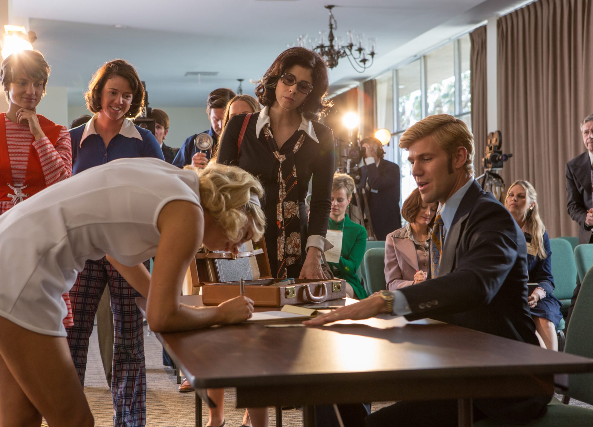
Whenever it worked for the scene, Sandgren framed his shots with women facing right and metaphorically looking forward into the future and the men facing left looking backward toward the past. Sarah Silverman, as World Tennis Magazine founder Gladys Heldman, moderates.
Photo by Melinda Sue Gordon/courtesy Twentieth Century Fox Film Corporation
How did Battle of the Sexes‘ story lead you in a different direction?
In this film, Billie Jean is lying to her husband but she’s also heartbroken; she doesn’t want to lie but she has to. And he knows she’s lying but he doesn’t want to bother her because he wants her head in the game. If you’re capturing this kind of sad but, on many levels, loving exchange, you don’t want to be right in their faces. Perhaps you just sneak a little from the side. Basically, the rule became when a character let us close, like in an intimate scene, we might also come in with a handheld and the prime and get very close. But normally we would rather step back and watch them from a distance. Perhaps they are feeling lonely, in which case we see them sitting on the bed from farther back and just don’t bother them. We tried to be a little more emotionally reactive with the camera.
Did you turn to any seminal ’70s films for reference before you started production?
We looked together at Altman’s Nashville, mostly for the way it handled the layers of sound and panning and longer takes. For lighting those more intimate, darker, private scenes I looked a lot at Gordon Willis, especially what he did in The Parallax View and All the President’s Men. The public scenes were more illuminated and saturated. I also looked at a lot of work by still photographers back then, like Ernst Haas. Another thing I really love about that 1970s-style storytelling is when you block the scenes with a single camera and you don’t really cut but you do a single take — but you feel like you’re cutting because you’re blocking the scene in that way, then it becomes a two-shot, then a closeup, then a wide. For example, when Margaret Court arrives, then steps out of the car and meets the ladies, then they drive off, then she walks with her husband to the hotel, it feels like it’s five different shots the way it’s composed and zoomed, but it’s just one. We thought the zoom is sort of the ’70s way of doing it and it felt more efficient. We always tried to tell the story in one shot and if we don’t need to cut, that’s great. But if we do need to cut, we have other shots to cut to. That was the general storytelling style. Then we had those more deliberate storytelling rules, like the emotionally reactive camera I described. A character is sitting alone in the room, so let’s pull back far and lock off the camera. When there was a flow to the narrative, then we used the zooms more.
Another rule we came up with was whenever it made sense in the scene, we would put the women facing right, toward the future and the men facing left, looking backward in time. It’s never possible to completely stick to a visual metaphor like that. It informed our way of thinking about the whole film, though. We definitely used it when it really mattered, like when the men and women are confronting each other, or when the scenes were charged with some emotion and we wanted to tell the audience, this is going backwards. There’s one scene where the women are being interviewed on the radio and they are actually looking left, and that was because the set looked like that. We felt it didn’t matter in this case because the confrontational charge wasn’t there.
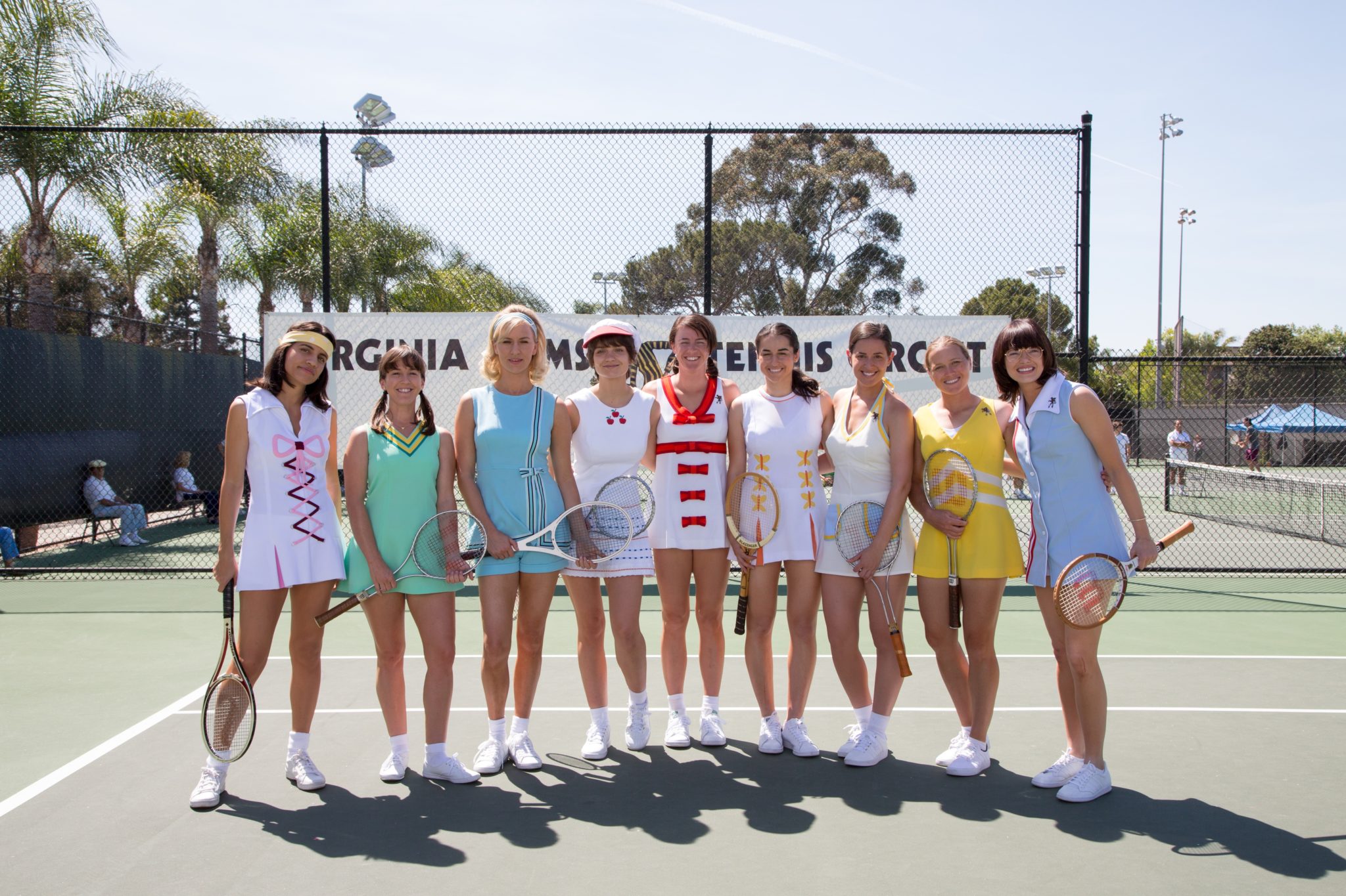
You’ve come a long way, baby: The film’s take on the women of the Virginia Slims Circuit, precursor to the Women’s Tennis Association.
Photo by Melinda Sue Gordon/courtesy Twentieth Century Fox Film Corporation
Was it difficult to hold true to this rule when the true story presented so many specific details and settings?
Yea, I like when we give ourselves rules and visual metaphors, even if used sparingly or very subtly, because it gives a much stronger internal logic to the project. We’re not just shooting things. We have reasons for why we shoot the way we do. I believe that when you think that way that’s going to always create a more interesting film, even if people don’t pick up on or understand what those rules are. There’s some consequence to your style. For Bobby, we always see him in a kind of prison. Very often, he’s behind bars of some kind, like window mullions, because he’s trapped.
How did you approach the match itself, which so many of us watched on television?
We shot it all on film, but the camera had those zooms, and then we watched the footage on TVs so we could see how it looked. We shot it like a real tennis match. When you watch a tennis match, the drama is all in the game itself and you don’t want to enhance that with visual tricks, like you would an action movie. If you do a cutaway to the ball or fly with it, that is saying that the tennis itself isn’t thrilling enough. The game points in the real match were so beautiful and interesting, and the actual tennis players that were standing in for Emma and Steve were playing every point like the real match. For those shots that were to be in the film they had rehearsed and choreographed them how and where to hit the ball and where they should put it. Then we shot it like an old televised tennis match with five cameras. We were a little more flowing with the camera moves between the points, to heighten the drama, but we filmed the actual points from just two baseline angles. It’s a fun game to watch; you think he’s going to smash it past her but she gets it and then he scrambles to get it back and can’t get there in time. It wasn’t like the power games we are used to now. I played some tennis growing up — when [Bjorn] Borg and [Mats] Wilander and Stefan Edberg were national heroes — then played a lot of badminton. Now I play paddle tennis a lot in Venice. I like it because everyone has a shot at catching the ball, which makes it a lot more fun.
What I really wanted to do was to zoom really, really far. We felt that the ultimate distance you can be from someone is far, far away, outside of TV. That is where their public selves live. Filming scenes about their private selves, we could be in the same bed with them. That was interesting to play with. We wanted to be far away but then zoom much further than you normally zoom. We found a very old Angenieux lens, a 20x zoom, which we used when you first see Steve Carell as Bobby Riggs in the opening shots of the film: You see a skyscraper, then we zoom into him. It’s establishing a sort of ’70s storytelling style right from the start.
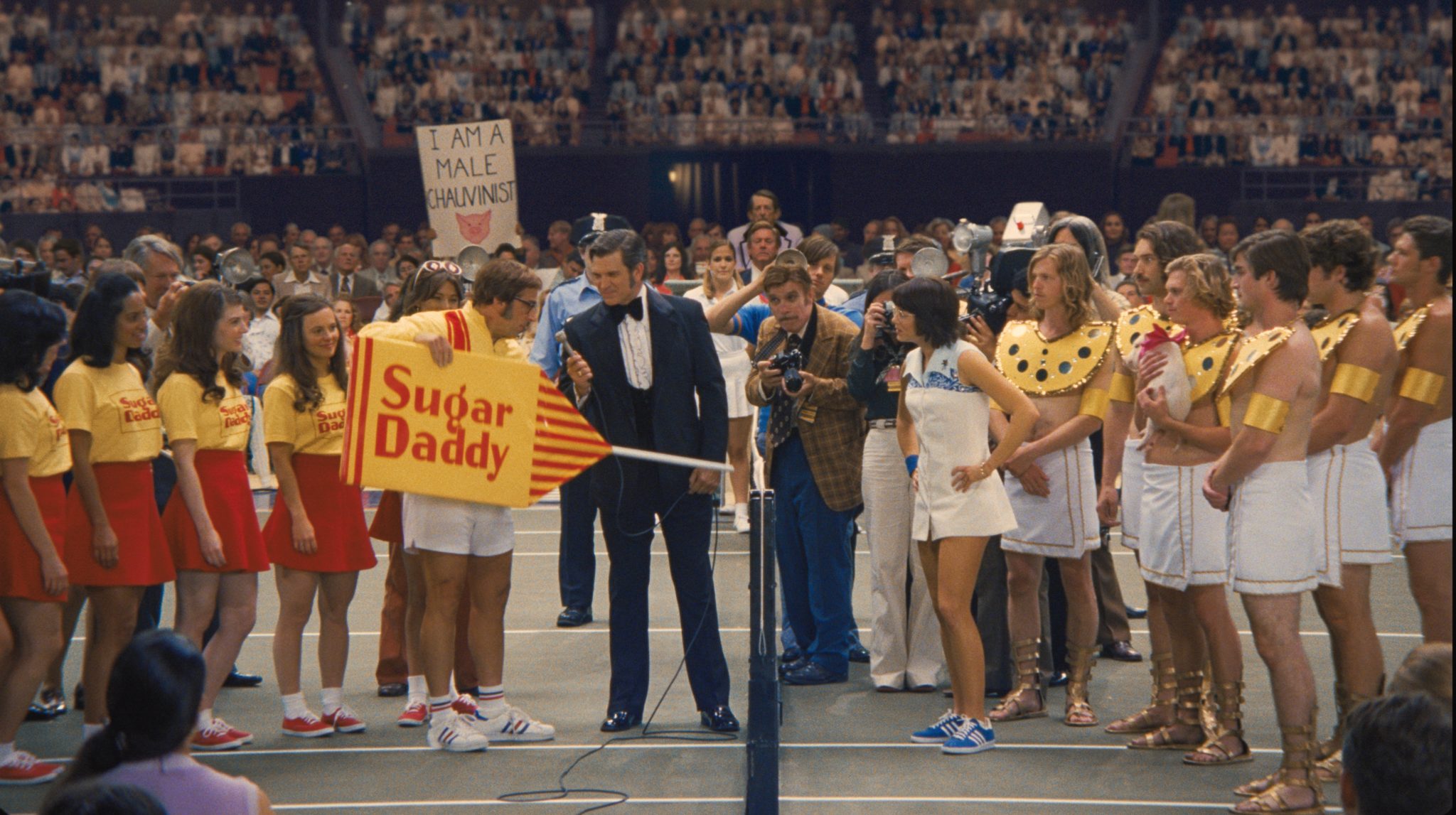
Sandgren captured the centerpiece tennis match on film but used plenty of sports television-style zoom and shot with five cameras.
Photo courtesy of Fox Searchlight Pictures
Where did you get that vintage glass from?
I worked with Camtec, as I had on Joy and American Hustle. They were really great in sourcing these vintage lenses and we tested them and then they bought them and serviced and fixed them. We had a lot of great vintage lenses. We had a bunch of different Angenieux 25–250 zooms, including the really old small one that is 3.7 T-stop, so really bad, but it was a beautiful lens. We also had the next Angenieux, the HR, which was a little more of a sharp lens, while the other one was more funky. Then we had the 25–500 20x zoom. We also had some beautiful Kowa Cine Prominar spherical primes, very beautiful Japanese lenses. And we had some Canon 50–1000 zoom for the tennis match.
You didn’t shoot with anamorphic lenses, like you did on La La Land.
No, we didn’t feel anamorphics were appropriate for this film. I’m not exactly sure why, but I think it felt a little too fancy with anamorphic. In La La Land the camera was like a character constantly saying, “Hello, here I am!” It was involved in everything in that movie. Here, we shot on the Arricam LT and it was more of an observer, watching delicately. As a cinematographer, I love that you can completely change your approach, depending on what the script needs.
Were there any surprises during production, for example, something worked the way it wasn’t intended to, or vice versa?
They gave Steve Carell this prosthetic set of teeth that were an exact copy of Bobby’s real teeth. But in the camera tests, they looked way too funny. We were all laughing, but it was distracting. They had to make them much less weird. The real Bobby was much goofier is so many ways than Steve is in the film. But those elements were also sort of unbelievable, so we had to tone them down.
Crafts: Shooting
Sections: Creativity
Topics: angenieux Arriflex RT Canon zooms linus sandgren period cinematography
Did you enjoy this article? Sign up to receive the StudioDaily Fix eletter containing the latest stories, including news, videos, interviews, reviews and more.
