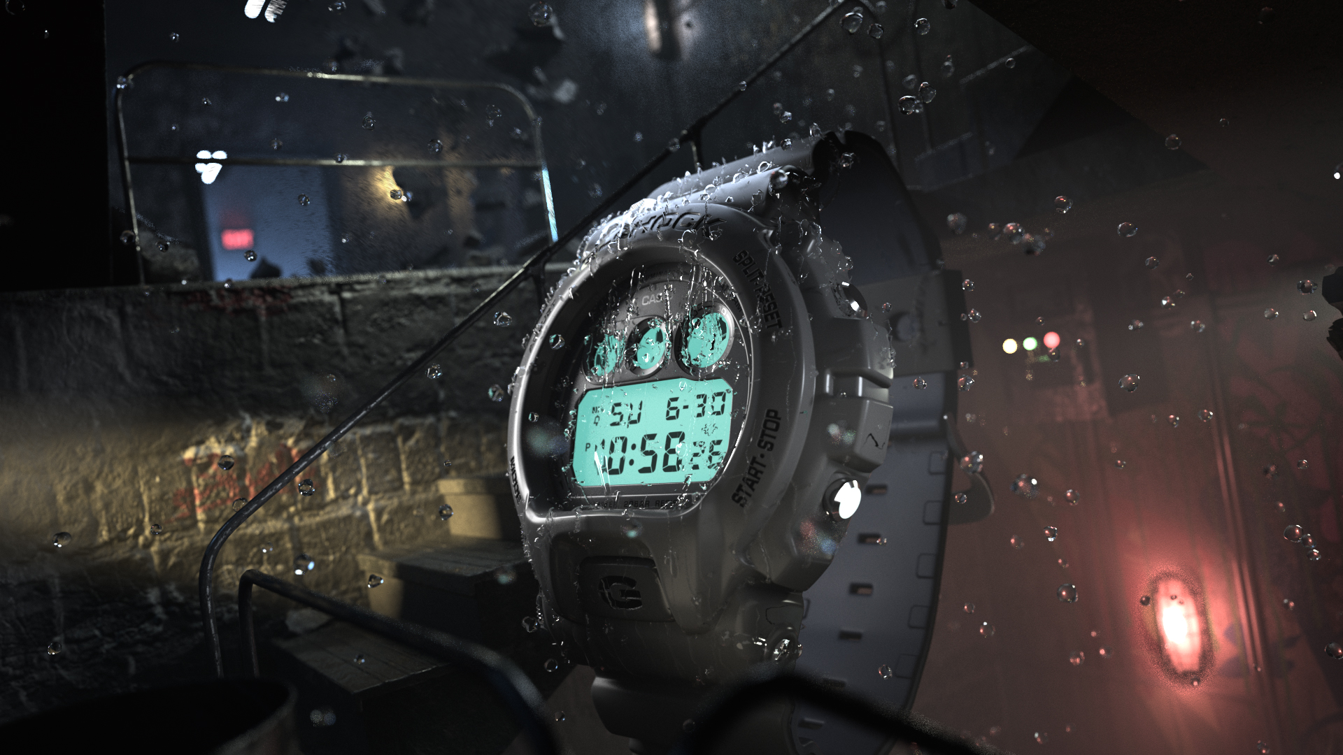
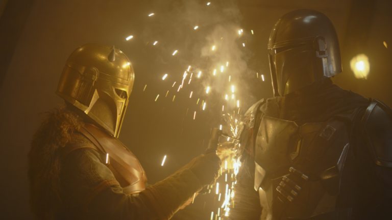
When Casio asked Dallas motion-graphics and design studio Already Been Chewed [ABC] to make a 60-second spot promoting the reissue of the G-Shock DW6900 watch, a classic design from 1996, it asked the team at ABC to develop its own creative take. “We wanted to evoke the 1990s, and that meant East Coast hip-hop to me because I’m from the East Coast,” recalls ABC founder and Creative Director Barton Damer. “So we wanted to feel like we were in New York somewhere. We custom-scored a track that had a 1990s hip-hop vibe, and the artwork was created to feel a little like that, too, with graffiti and things like that.” There was a conceptual flourish, too, with the animated one-shot spot evoking the idea of a cyclical journey, with trends receding and then becoming popular again over time. ABC’s vision of the G-Shock 6900 was used as Casio’s main hero image for the watch, and the video played online and at in-store point-of-purchase displays. ABC also provided high-res renders out of Maxon Cinema 4D for Casio’s use in billboards, print ads, and its sponsorship of Street League Skateboarding. We asked Damer how his team executed the project.
StudioDaily: How much of the creative direction came to you from the client, and how much did you come up with independently?
Barton Damer: This was a super-fun one. There was literally no direction from the client. It was, “We’re re-releasing this watch. Here’s our budget. What would you do?” We were able to think through an entire concept. One of the things that’s subtle is that you start out on the cracked asphalt of a basketball court and you zoom into the watch and have a journey that seamless goes from transition to transition through different city scenes. At the very end of the spot, you end up where you started. We developed that concept because things come back around again and get re-released, just like the 6900 watch is being re-released after 20 years.
Is the spot 100% CG?
Yes, 100%. We’re doing everything from modeling the product itself to creating worlds. Obviously, lighting and texturing is all done in 3D space, and they are quite heavy renders with big city scenes.
What are your primary software tools?
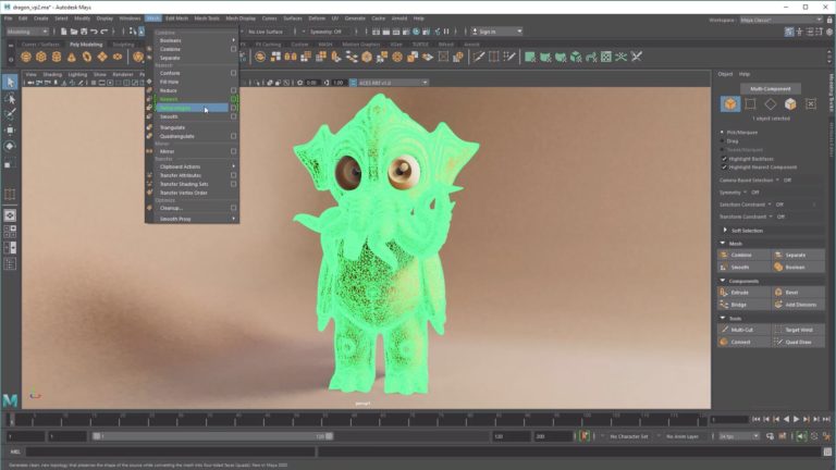
We used [Maxon] Cinema 4D as our primary tool, a little bit of [Adobe] After Effects for some final compositing, and a little bit of [SideFX] Houdini for a lot of the smoke and vapor simulations in different city scenes coming out of grates and subways, things like that.
Was the model of the watch something you had to make, or was that provided by the client?
We made that. They sent over reference photos and Illustrator files. Some of our clients provide CAD files and we do what’s called a re-topo process over the CAD files so that it’ll work better for animation, but for this we went off of having the product in hand and photography.
Did you have to pay special attention to the face and the way it glows and the exact hue of it to make sure it’s dialed in exactly right?
You take that into consideration, but in the look of the spot we definitely exaggerated it, so there’s an extra bluish-green glow across the face of it. It didn’t have to be 100% accurate — we overcommunicated the glow aspect of it in an animated way, if you will.
The lighting is very moody, and there are a lot of specular highlights, especially in the subway scenes and neon elements. What kind of ideas guided creatively what you were looking for visually?
We used Redshift Renderer for this one, and one of the big reasons we started using it was because of the way it handles volumetric lighting. Redshift is super-powerful with volumetrics and renders really fast any time you’re dealing with them. We also wanted to have an element of reflectance, almost like it had rained previously and was slightly drying up. That allowed us to get nice reflections from the neon lights everywhere, which helped the look as far as creating depth and volume and layering with the fog element that Redshift allows us to pull off. The way Redshift handles volumetric lights was a breakthrough on this project — being able to render scenes that large with that much fog in the scenes.
And when the watch smashes through the ground and generates debris, those particles were generated by Houdini, right?
Yes, and that was probably the only direction from the client — we needed to show that it was durable, so that’s where the smashing through the floor came in. And we also had to show that it was waterproof, which is where we came up with the idea of having the fire escape water spray all over it, which shows that it’s water-resistant as we see the water droplets running across the face of the watch. And also the light-up LED face that G-Shock watches are known for. That is on throughout the spot and illuminates different areas as it gets closer to buildings and things like that.
The camera moves vertiginously all the way through the spot, without any cuts — everything is accomplished by where the camera is and what it’s moving past at any time. How hard was it to conceptualize?
That was a big part of the concept. We wanted it to be a seamless loop, to communicate the flow of things coming back around to be re-released. Our challenge was, let’s pull this off without any camera cuts. One of the challenges of doing that is you’re going to see the watch small, but we also need beauty shots of the watch to be close without these zig-zag camera moves in on the watch and back out. That’s where the transitions came in. As it went behind a staircase, then it was revealed in the next stairwell it would be larger and we’d get a beauty shot of it. That definitely had to be well thought out and planned.
A lot of the time in films people get very excited about these long shots that are one camera move — but they also draw attention to themselves in a way. The way you’ve implemented it is very utilitarian — we’re watching it and seeing what you want the viewers to see, and you’re doing it in a smooth way that doesn’t make us aware we’re being guided this way and that. It’s just a ride.
Mission accomplished, then.
Credits:
Studio: Already Been Chewed
Creative Director: Barton Damer
Head of Production: Aaron Smock
Designers: Barton Damer, Bryan Talkish, Thomas King, Patrick Goski
Animators: Bryan Talkish, Barton Damer, Thomas King, Mark Fancher, Lance Eckert, Aaron Smock
Product Modeling: Thomas King
Software:
Maxon Cinema 4D
SideFX Houdini
Adobe After Effects
Already Been Chewed: www.alreadybeenchewed.tv
Crafts: VFX/Animation
Sections: Creativity
Topics: adobe After Effects already been chewed barton damer casio cinema 4d Houdini Maxon sidefx
Did you enjoy this article? Sign up to receive the StudioDaily Fix eletter containing the latest stories, including news, videos, interviews, reviews and more.


