Designing Logos and Titles for an Epic Sports Competition Series
Portland Oregon-based boutique motion/production studio The Other House has worked on numerous broadcast branding projects over the years. But its recent collaboration for NBC’s new sports competition series, The Titan Games, was among the largest and most challenging.
Based on host Dwayne Johnson’s desire to push everyday athletes to reach their full potential, The Titan Games, from Universal Television Alternative Studio, A. Smith & Co. Productions and Seven Bucks Productions, offers competitors a chance to step into the Titan arena and tackle mental and physical challenges designed by Johnson. Winners advance to Mt. Olympus to face the ultimate challenge and the male and female winners are dubbed a Titan. Ultimately, Titans return to compete against each other and just one man and one woman take home the grand prize of $100,000.

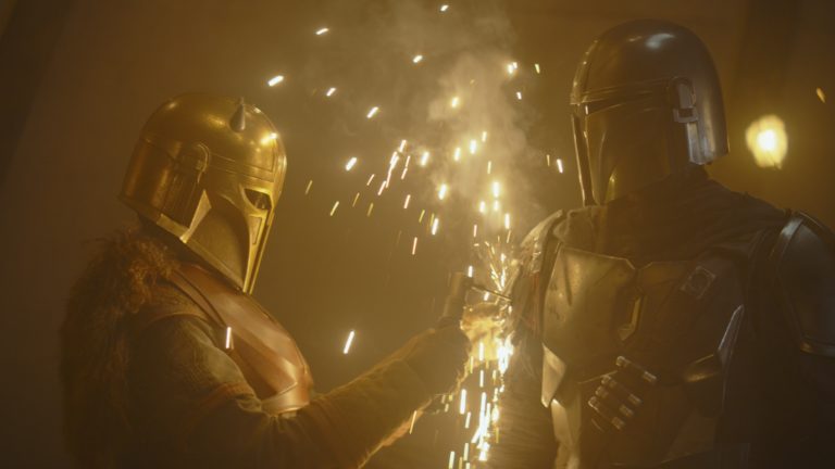
The Other House used C4D’s Voronoi Fracture for this final render of the title for one of the show’s challenges.
Working on the show for over a year, The Other House was involved with everything from initial logo development through shooting and post. It was a great opportunity for the company to show what they can do for a prime-time broadcast series, says Chris Roth, The Other House’s executive director and principal animator. “It really tapped into many of our creative specialties from logo and brand development to big, sporty broadcast graphics. And the show also features a lot of techy infographics and a good deal of high-end VFX compositing challenges.”

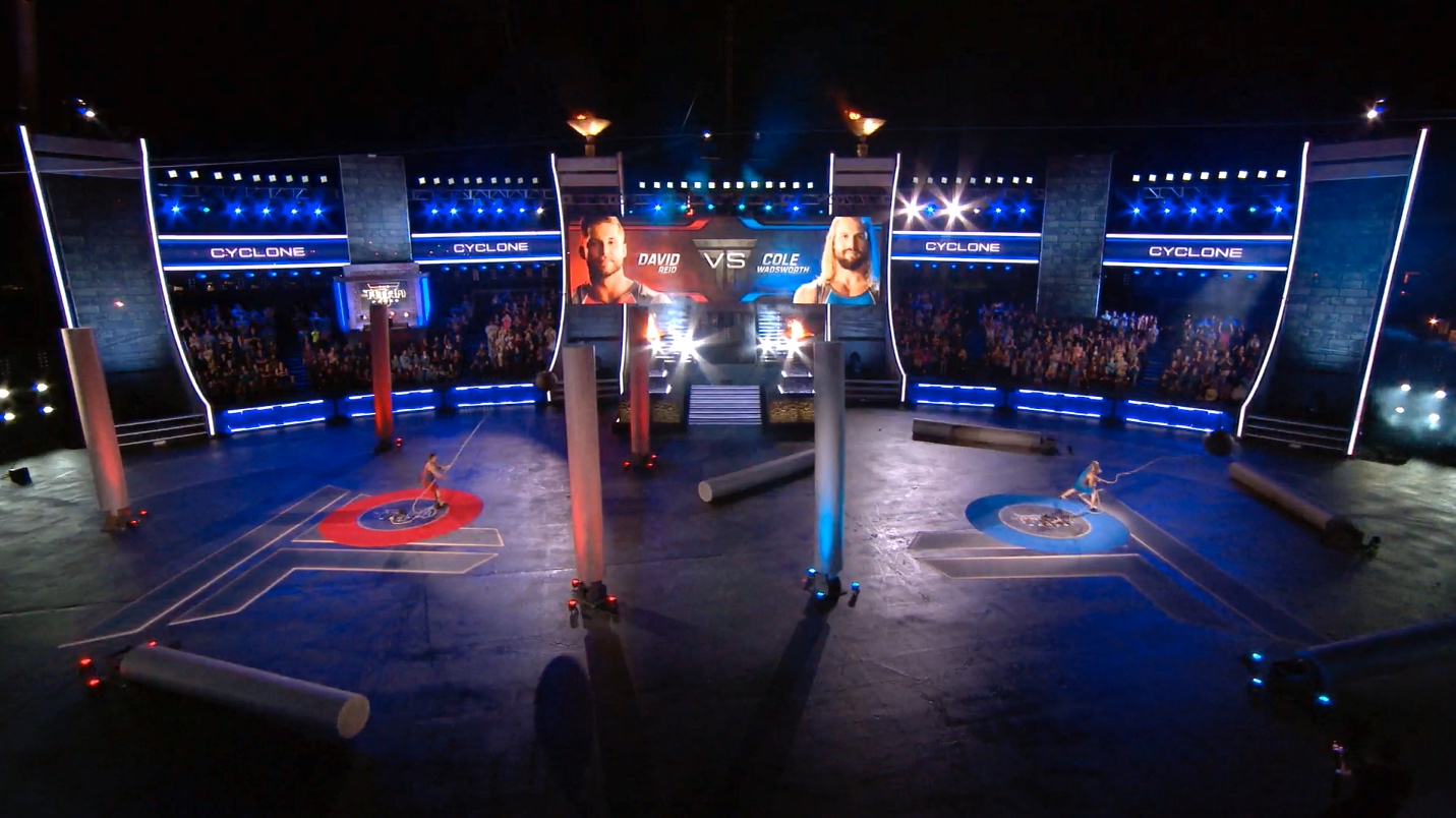
Large-format LED screens were well integrated into the set.
While the process for creating the 10-episode series was intense, it helped that the Other House team was on-site for the load-in and live taping. Working closely with producers and Director Alex Rudzinski, they helped block out show sequences so the graphics and live elements supported each other cohesively. Roth and two additional designers at The Other House, Adam Gross and Andrew Nicolai, also spent nearly three weeks on site, working around the clock to develop and format stylized graphics for the nearly 20 integrated LED jumbotron screens offering information and stats about the competitors and game challenges.
“We had to develop many different templates to produce loads of content for the irregularly-shaped screens on set,” Roth recalls. “We worked all day doing that, and all night long we were on-site during taping. We set up a mini-factory in a local hotel room. It was quite a marathon.”

Adam Gross, The Other House’s animator and designer (left), and Chris Roth on the set of The Titan Games.

The show’s many camera feeds could be viewed from inside the director’s truck.
Branding a New Kind of Sports Series
Branding the series was tricky for many reasons, Roth recalls. For one thing, because the series was still in development when The Other House began working on design options, his team’s work needed to evolve along with the show. Early on, ideas were inspired primarily by traditional sports graphics. But that American Ninja Warrior sports sensibility didn’t quite fit as the arena took on more of an epic Roman colosseum fantasy look. Set development mixed things up even more with a variety of high-tech feature revisions that introduced a Tron-like futuristic vibe, Roth says.

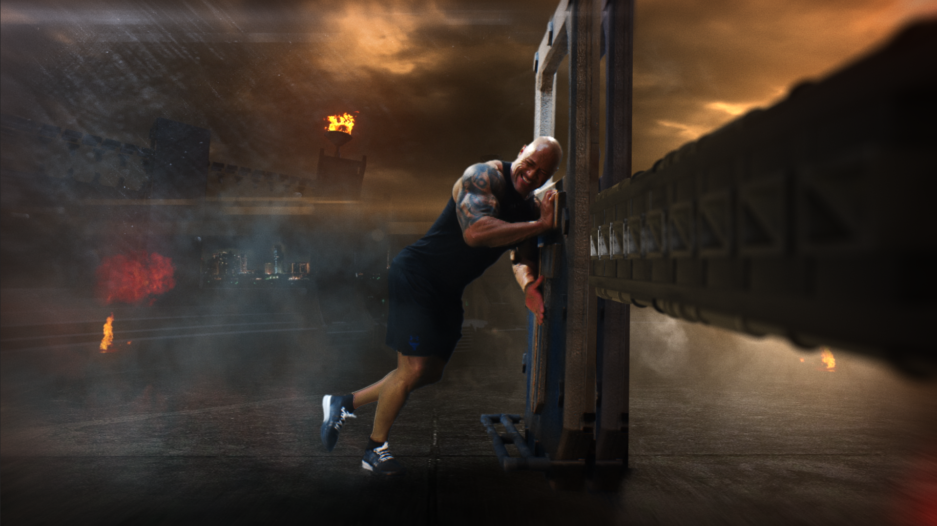
Scenes featuring Dwayne Johnson engaging in each challenge were shot on green screen and enhanced in post using elements modeled in Maxon Cinema 4D and composited in Adobe After Effects.
Fortunately, the line of communication between NBC and Roth’s team was very open and clear so everyone was able to work together to make changes quickly and effectively. “Every step of the way we got notes or new developments on the creative,” Roth says. Ultimately, the final branding direction has just the right blend of future, past, sports and fantasy to make the show dynamic and inviting for people of all demographics.

The show’s signature T icon is displayed throughout the show’s expansive arena and on the competitors’ uniforms.
Designing the Logo and Screen Graphics
Roth and his team went through many iterations of the logo before coming up with the final design. “A huge part of the process is letting go,” says Roth. “We work very hard deriving logo marks and producing a number of successful designs. But if and when the show’s creative evolves, we have to evolve with it. I liken it to the scientific method, data might point to a strong conclusion, but if new data is introduced that contradicts it, it’s back to the drawing board.”
Knowing the show needed an iconic emblem, The Other House explored various T and TG forms, finally settling on a single T inspired by the columns found in the Colosseum in Rome and tweaked to have a more modern feel.

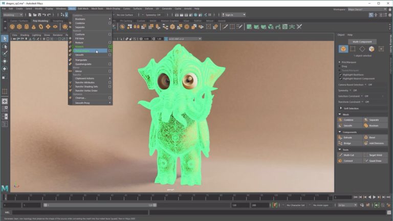
The Other House created more than 50 different logos before NBC approved this final version, which was modeled in Cinema 4D and rendered with Octane.

Inspired by the Colosseum in Rome, the Titan T design was a major inspiration for the entire set.

Many logo designs were explored during early development.
The Titan Games’ set was so huge it wouldn’t fit on the Universal lot, so it was built on a vast motor speedway parking lot east of downtown Los Angeles. Filming outdoors meant all shooting needed to be done at night during limited windows of time. Roth and his team worked closely with screen operator Wyatt Bartel, of Los Angeles’ LuxMC, to facilitate daily changes and streamline the pipeline for the show’s integrated graphics.
“It was imperative that everything worked smoothly, because when you’re working on a show of this magnitude with limited time to shoot, production can’t be held up because of the graphics,” Roth explains. To get an idea of the magnitude of this challenge, consider that 65 competitors in four different uniform colors were processed and formatted for the various screen layouts on set, totaling more than a thousand assets.

The action picked up at sundown on set with filming starting at 7 p.m. and wrapping up around 5 a.m.

Wyatt Bartel controlled the on-site screen station, which featured a real-time GUI model of the set to help visualize all the screens on set.
Keeping Things Fresh
Though Chris and his brother Steve, along with their wives, Amber and Lara, launched The Other House just six years ago, all four of them had been working in the industry for over a decade so they brought a lot of experience and contacts to their new company. “We are a pretty boutique operation with strong roots,” Roth says. “Besides the family element, my three lead designers are all friends I met at Parsons School of Design over 20 years ago.” Year after year, as The Other House keeps getting busier with an increasing number of exciting projects, Roth believes one of the keys to its success is a commitment to taking every aspect of a project seriously. And the earlier The Other House gets involved with a project, the better the outcome.
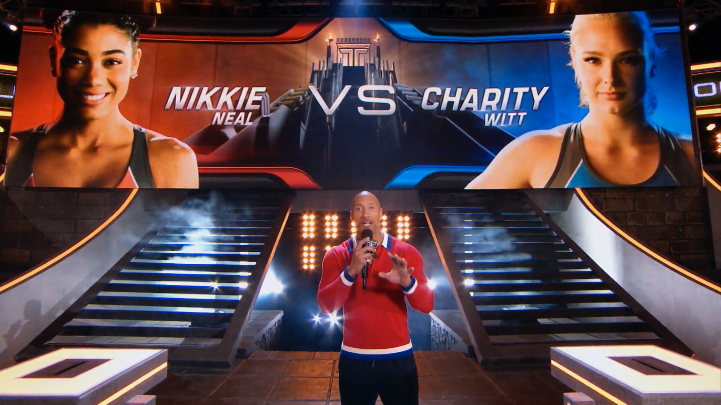
Every show is built around a unique identity. In this case, it was The Rock.
“When we research a show’s identity, we focus on what makes each project unique, because homing in on the talent’s brand is key to branding their show,” he says. In The Titan Games’ case, the key was The Rock. “What he brings to the show is really exciting. He’s an athlete and a larger-than-life personality.”
For Roth’s team, one of the best things about branding projects is that each one is a different and exciting puzzle. “I’m really grateful that we’re not pigeonholed to a narrow design aesthetic,” he says. “We’re always working on several different shows at the same time, and they’re all wildly different in concept and demographic. It’s refreshing and allows us to continue to keep growing creatively.”
Did you enjoy this article? Sign up to receive the StudioDaily Fix eletter containing the latest stories, including news, videos, interviews, reviews and more.
