How Longtime Collaborators Cinematographer Chris Teague and Colorist Nat Jencks Crafted a Colorful Look for the Critically Acclaimed Series
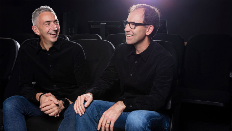
At Goldcrest Post in New York, senior colorist Nat Jencks collaborated with cinematographer Chris Teague to finalize the look of Russian Doll on Netflix. The critically acclaimed first season of the series centered on a young New York City woman named Nadia Vulvokov (Natasha Lyonne) who, after being killed in a traffic accident, finds herself continuously reliving a birthday party held in her honor the same night. The show is co-created by Lyonne, Leslye Headland, and Amy Poehler.
Jencks and Teague had previously worked together on several independent films, including Love After Love, which won the Best Cinematography Jury Award at the 2017 Tribeca Film Festival. Russian Doll marked the second time that they teamed up for a television project, having previously teamed on the NBC series Shrink.

Natasha Lyonne in Russian Doll
Netflix
Teague says that he was attracted to the show by its novel premise and the opportunities it afforded for creative cinematography. “Most of the work I’d done before was naturalistic, grounded material, where this show is a little absurd and has a sense of hyperrealism,” he explains. “That informed the look. We started with a look-book that Leslye Headland and Natasha Lyonne had put together in pitching the show. It was full of surrealist, absurdist art imagery. Through conversations with the production designer, Michael Bricker, we translated that into cinematic references and arrived at a color palette.”
“Our reference images were high contrast, high color, high saturation, very punchy,” he notes. “Luscious images with a lot of contrast. Other references included photography from the ’80s and ’90s of our shooting locations in the Lower East Side and East Village. The colors there were saturated and rich, but not in the way that you typically see them in digital cinema today.”
Teague brought Jencks into the project during pre-production for help in developing a color pipeline that would carry the look through post. “We talked about finding the right balance for the show,” recalls Jencks. “It was important to Chris that it have an organic, gritty, dirty feel. So, we settled on a custom hybrid Fuji film stock emulation, and we did some testing to see how that stock interacted with the make-up, wardrobe and key pieces of art direction. As production got closer, we discussed HDR. As this was our first HDR collaboration for television, we did a lot of research and testing of the format. Chris and I also spent a lot of time watching other HDR content and noting things we liked and didn’t like.”
Jencks suggested that if shooting 4K, Teague consider shooting the series with the Red Helium 8K digital camera. Lightweight and compact, the camera would allow to Teague to capture natively in ultra-high resolution. “Nat had been impressed with the way the camera captured highlights and skin tone compared to previous generations of Red. He felt the camera represented a jump in performance,” Teague says. “We shot some tests and I agreed with him. I initially thought that shooting with an 8K camera was overkill, but when I got a look at the tests, I saw how useful oversampling could be. The finer-textured imagery allows you to mess with it more. You can dirty it up without it breaking apart. You can add more grain and push the colors further. It was a difference we really liked.”
Jencks helped to facilitate the HDR workflow by creating both SDR and HDR LUTs for the show. “This meant that, although in-camera and traditional monitoring was done in SDR, Teague had the ability to easily check shots in both SDR or HDR when desired,” says Jencks. “He could pop shots into the monitor and compare them in SDR and HDR during breaks or downtime.”

Natasha Lyonne and Tami Sagher in Russian Doll
Netflix
Production for the series centered on the neighborhood surrounding Tompkins Square Park in New York’s East Village. Principal locations included the loft apartment where Nadia’s party is held, a neighborhood deli called Sunny & Annie, St. Nicholas Carpatho Church, the 7B Horseshoe Bar, and the park itself. “The loft apartment was the location we had the most control over, and we used it to define the look of the show,” says Teague. “Michael Bricker did an amazing job in introducing color into that space. He brought in neon fixtures and littered the space with art projects created by Nadia and her friends.”
Carrying that colorful look through to other locations proved more challenging. “New York City has a lot of color built in through storefronts and streetlights, but not enough,” Teague notes. “Tompkins Square Park is almost entirely vapor-lit and we didn’t want it to appear monochromatic. We used cyan gels on maxi brutes on lifts and par cans. We also used backlighting outside the park to bring our color palette into that world. For other exteriors, we used four-foot LED tubes that could be any color of the rainbow and tucked them into doorways and corners or inside buildings to add splashes of color.”
Teague points to a scene set in a basement beneath the 7B Bar as particularly tricky to light. “It was the most unfriendly shooting location you can imagine,” he recalls. “It had six-foot ceilings. It was tiny, cramped and disgusting. It looked like a dungeon. But when we got down there, we fell in love with it. We decided to light the space in the most unnatural color we could imagine. We let go of any sense of naturalism. We bathed it in blue LED light, which just felt right for the show. With the LED fixtures, I had total control and freedom to play with it in the moment. It was amazing and something that I really enjoyed.”
Teague worked with Jencks to further accentuate the distinctive lighting and color during final grading sessions at Goldcrest Post. “Chris did a beautiful job in capturing the mood of the Lower East Side,” says Jencks. “His imagery feels organic, but there is an electricity to it that’s not muted, soft or restrained. It’s bright and colorful.”
Jencks adds that applying a custom Fuji hybrid film emulation gave the production imagery added texture and helped to bring out the contrasts in the color palette. He notes that the result is a filmic look that is in tune with the show’s novel vibe. “We didn’t want the show to look broadly lit, like a mainstream comedy,” he says. “While the show has comedic elements, the aesthetic is very much about the personalities of the characters and the environment that they live in. We didn’t want a look where the people stand out and the backgrounds fall away; these people inhabit their environment. The city is a character in their story.”

Natasha Lyonne in Russian Doll
Netflix
Goldcrest is both certified for Dolby Vision and part of the Netflix Post Partner Program (aka NP3). Jencks used DaVinci Resolve to master the series in Dolby Vision with a Sony BVM-X300 HDR monitor for review. He also reviewed HDR material on an LG C8 consumer monitor to get a sense for how things would look in home theater environments.
Both Teague and Jencks were delighted by the results. “The show looks beautiful in HDR,” Jencks says. “The colorfulness of the Lower East Side and the grittiness of the city really come through. So much of the show occurs at night, with much of the light coming from neon signs, street lights, car lights and fluorescent tubes. Those things lent themselves to HDR very well. It was a treat.”
Teague notes that grading sessions were intensive and detail-oriented. “Nat is incredibly passionate about his work,” he says. “He brings so much to the table and the conversation doesn’t end in the grading theater. We talked on the phone and traded emails over the weekends, exchanging ideas on how to make the show better. What I love about Nat is that, on the technical side, he’s a total genius and obsessive about digging into the minutiae of the color science, but he’s also a filmmaker who cares about the story and how it’s impacted by color. His ability to balance the technical and artistic sides makes him a great collaborator.”
That level of commitment was evident in every aspect of the show, says Teague. “Russian Doll is an exciting example of collaboration,” he observes, “from Natasha, in terms of her voice and presence, from Leslye through her novel storytelling, from Michael Bricker through his unique production design, and from Nat in how his sensibilities informed the look. All the crafts and disciplines worked together to make it a successful show.”
“And it was fun,” he adds. “When you start a new project, it’s often hard to tell how it’s all going to fall into place. With this show, everything did fall into place, with every discipline contributing in a significant way. It was very satisfying.”
Crafts: Post/Finishing Shooting
Sections: Creativity
Topics: Chris Teague goldcrest post hdr maxi brute Nat Jencks Netflix
Did you enjoy this article? Sign up to receive the StudioDaily Fix eletter containing the latest stories, including news, videos, interviews, reviews and more.

