How Stomach-Turning CG Imagery Amplified the Emotions of Director Richard Shepard's Lurid Story of Jealousy, Conflict and Revenge
The Perfection, a twisty psychological thriller from director Richard Shepard, best known for the 2005 Pierce Brosnan film The Matador and the Emmy Award-winning pilot for Ugly Betty, seemed to come out of nowhere when it arrived on Netflix last month and created a minor sensation among viewers who couldn’t quite believe what they had just seen. The story of rival cellists Charlotte (Allison Williams) and Lizzie (Logan Browning) quickly spirals into a revenge yarn filled with sex, violence and horror. The Independent reported that watching The Perfection was literally making its audience sick, collecting tweets from viewers who claimed they were nauseated by the film — but maybe in a good way?

Logan Browning in The Perfection
Netflix/Cooke Optics
Part of the film’s appeal comes from its handsome production values. It was captured by DP Vanja Černjul, ASC, with the Panasonic VariCam Pure (the VariCam 35 camera head connected to a Codex V-Raw 2.0 recorder) shooting 4K through Cooke Anamorphic/i and S7/i lenses with the occasional split diopter. It’s also a showcase for production design and art direction by John Marcynuk and Stevo Bedford, respectively. There are classical pieces by Bach, Mozart and Handel. Even the sex scene at less than 20 minutes in is tasteful. It all looks so handsome that the truly grody scenes at the film’s heart sneak up on you — starting with a long sequence that begins on a bus ride in the middle of nowhere where Lizzie starts to believe she has insects growing inside her.
The disgusting VFX work was completed by Zoic Studios in Vancouver, where ECD/Partner Andrew Orloff and VFX Supervisor Rob Price — with help from their on-set VFX supervisor Kevin Struckman — helped develop a slate of VFX that includes insect-infested bodily effluvia, amputations, and a torture tableau. We talked to Orloff and Price about how, at the urging of director Shepard, they pushed The Perfection “a little over the edge.”
Note: Though we tried to be circumspect about the details, this interview contains some spoilers for The Perfection. It’s hard to discuss the VFX without giving away some of the twists.
StudioDaily: How did you get involved with the film?
Andrew Orloff: It was a local Vancouver production, and I believe post was in Vancouver as well. It came to us as a little bit of a cold call. People know the kind of work we do, and they were looking for an all-Vancouver VFX budget. We also have a history of working with Todd Masters, who was the makeup FX and prosthetics person on the show. So we went for a meeting and read the script, broke it down, and made our pitch. There was some pretty emotionally impactful stuff we had to put together, and it was important that it read really visceral. We sent a reel over, and the next thing you know we were doing meetings and figuring out how we would supervise it and do the job. After it was shot, that was where Rob and hs team internally took over doing all of the creative work for the main sequences. It was originally presented to us as a theatrical release, and Netflix came later. It was a pleasant surprise for us that it’s gotten so much attention. It’s a little bit out there — it’s a big swing. [Laughs.] But we were totally into it.
It’s not a hardcore genre movie, but it really is a horror film wrapped up in different clothing. It’s well concealed up to a certain point. How did that affect your thinking about the tone? I know you wanted it to be visceral — for audiences to feel it and have a physical reaction.
Rob Price: A lot of the more visceral scenes come out of left field. We were referencing horror genre films from the past that are very visceral in feeling. We found ourselves pushing toward making you feel an emotional reaction toward what you were seeing on screen. It was very intentional and very collaborative with the director, who definitely wanted to feel the brutality come across in the final imagery.
AO: The scene on the bus — talk about a scene that comes out of nowhere and escalates in an intense way really quickly. The ask for us and the director is to make this hallucination that’s so intense and so realistic to the person having it that it really makes sense that they would chop off their own hand to try to get out of it. This is a lower-budget adventure in the horror genre, but this can work to your advantage: to have a low number of VFX shots, but to make every shot count. Rob and his team spent a lot of time getting the bugs to crawl out of the arm just right so you would believe the only appropriate reaction from her is to chop off her arm.
The physical performance by Logan Browning, too, puts that across in a way audiences can relate to on a one-to-one basis.
RP: 100 percent. It definitely helps us when there’s a lot to work with in frame, because you just have to sweeten what’s already there instead of reinvent the wheel. That whole scene is really surreal, so trying to make it feel like it lives in a realistic world is definitely a challenge. We pushed hard to make that come across.
AO: It’s an interesting film, because the violence that we are portraying is an outward portrayal of the jealousy and conflict among the characters in the show. It’s like what Rob said about having the performances to work with, because there’s so much strong emotional stuff in there. We’re looking for our work to put an exclamation point on it. It’s not your typical two kids making out at summer camp who get randomly murdered by some dude. The people who are interacting with each other in violent, horrific ways have a lot invested in each other throughout the movie.
It’s not a Friday the 13th movie, and a lot of what happens here takes place in well-lit rooms or outside in bright sunlight, so you weren’t going to be able to hide or tuck things in among the shadows. Is rendering stuff that looks photoreal in a brightly lit environment a solved problem in your experience, or is it still a challenge to get it to look right under those conditions?
RP: Seeing those bugs out in the daylight, it was a challenge to get them to look photoreal. As for the arm itself, they were replacing [Browning’s] entire arm. A lot of work went into making it match her practical arm. And the interior scenes have very strong lighting. It takes a lot to make that come across.
AO: It’s playing against type, too, since a lot of the stuff that you might see in typical horror is very dark, very rim-lit, and then using these magical lights to selectively hit people’s faces in certain ways to portray a feeling of spookiness. There’s a language around that. It’s solved in a way, but it is more challenging. When you’re in that dark environment you can add light to your CG, to make it look a little sexier without having to show the whole thing. But Rob is absolutely right. Especially in the scene where you’re looking POV down on her arm and the spiders are crawling out. He and his team had to replace the entire arm with a CG arm. And it’s in bright sunlight. There’s nowhere to hide.
It’s not just the bugs coming out — it’s the ripping and tearing of tissue. You had to build all that so that it looked correct.
AO: I would say that’s the most challenging part, the actual interaction of the skin in that shot.
RP: That’s probably what took the longest overall, just getting that final piece of the puzzle to fit together.
Was it pretty clear that was going to be the biggest challenge or did it end up being trickier than you thought?
RP: No, we definitely knew that was going to be one of the bigger challenges for that scene — how is this going to come out of her arm? What exactly does that look like, a bug breaking out of someone’s arm? And there are a couple of moments of anticipation before it happens, because the bugs are crawling under her skin, then they need to break out and be on top of it, driving her to the climax of the scene. We knew there would be challenges to make the entire story cohesive.
Lizzie doesn’t bow out of the story or die. She’s immediately back in as one of the two key characters, but missing part of her arm. Was that practical, where she was dressed on set so her hand was balled up and concealed or did you remove it?
RP: It was a combination of all the above. Like anything good they put in some practical effects, and there were some green sock hands we had to totally remove. They did a little of each so it doesn’t feel like it’s overdone. Like most good VFX, it was very tasteful in how we get around the problem.
AO: In any of those kinds of shots there’s a lot of variability of difficulty level. If somebody’s got a green sock on their hand and you’re chopping it off and removing some stuff from the foreground, anything in the background has to be recreated. It’s not technically difficult, but it creates a lot of labor, and it gets a little sketchy when that green piece needs to be removed in front of somebody’s face or hair or clothing moving around. Production was responsive to using the right technique for the right type of shot. Some were easier to do than others. They established a language very quickly about which ones needed CG to sell the shot, when was it really important, and when could we get away with using a prop or prosthetic or something in between.
RP: Even in shots that had the prosthetic, it wasn’t the balled-up fist with a thing that’s way too long. It was an offshoot of the arm that had to have the actual hand removed. So even the practical was done in a way that wasn’t going to be goofy. That’s often what happens — you can tell there’s a hand somewhere in there.
AO: Yeah. In production they had discussed putting a piece that attached to the elbow that came off …
RP: Yes, exactly.
AO: … and the real arm was tucked behind her back with the prosthetic strapped on at elbow level. So there was a certain amount of clean-up on those shots as well, just integrating it and hiding the tells that it was a dummy hand.
Which falls under the heading of “movie magic,” making those tricks and dodges look convincing in the final product.
AO: And then the other part of the work — there’s a lot of fighting and a lot of stabbing in this movie. [Laughs.] We do that type of work with a lot of coordination with stunts. Usually, we’ll have a handle with no blade that’s used in the fight. That can be tricky both editorially and performance-wise, making sure the CG blade is accounted for [during photography], and there are some pretty hefty knife-wielding scenes in this picture. There’s a shot where [Lizzie] drags the knife, stabs [Charlotte] through the forearm and then brings the knife through her entire arm. That was a combination of the CG blade, some CG blood, and some practical blood-drip elements as well.
What were the workhorse tools you used on this project?
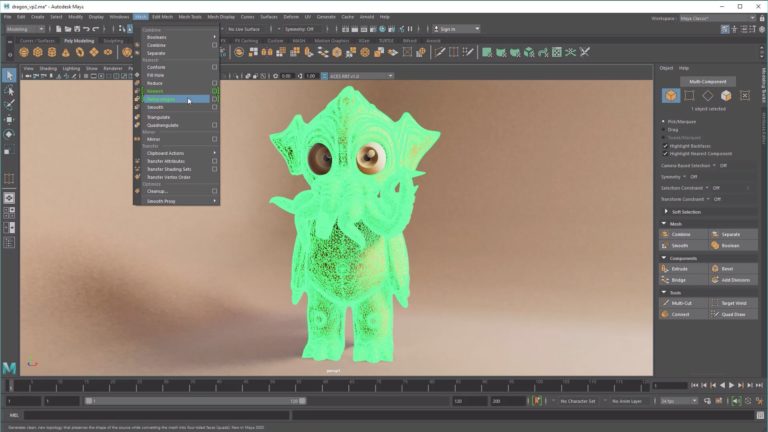
RP: A lot of Maya on the 3D side, a lot of Nuke for compositing, and Photoshop for matte painting, set extensions, and everything like that. For this particular picture, those were the workhorses.
I know you want to avoid spoilers, but we’ll drop a SPOILER WARNING here before I ask about a shot late in the film where one of the characters has had, let’s say, some body modifications performed. It’s a well-lit shot, it’s kind of nightmarish, and it’s key to the impact of the film.
AO: It was one of the cooler things that happen to us on the VFX side. Coming back to the script, the resolution of the whole story is a very weird mix-up between flat-out horror and revenge and this twisted sense of … ironic justice. Our job overall in the show was to justify that. The resolution of it is so intensely brutal that the rest of the story had to be of an intensity that justified that resolution. So you wouldn’t think, “Well, that’s going maybe a little too far.” Instead, your feeling is, “Yeah, that guy got what he deserved.” And what he got was pretty messed up. [Laughs.] He had to look really gross.
Was there a lot of back-and-forth iteration to get that shot right?
RP: There was a fair amount of back and forth trying to get the right feel for the bruising and blood drying and the amount of time that had passed. It’s full CG — arms, legs, everything. We’re definitely lucky that the director wanted to have this pushed further and further. Usually there’s somebody trying to rein you back in. “You’ve gone too far!” Having a collaborative experience with someone who was definitely pushing [us] a little over the edge was really fun.
AO: One of the things we try to do at Zoic is find out the back story for the visual effect — what caused it and how did it get this way — as a justification for why we’re even doing it as a visual effect in the first place. The director was really conscious that he wanted this one to imply the process that you didn’t see. He was very specific about what they had done but, aside from the horror of the image, it’s really that negative space [of what isn’t actually shown] that makes it effective. The film lingers over that shot for a long time. And I think that once you get over the initial shock of the image, you are supposed to soak it in and say, my god, these people did this thing to this person. They exacted their revenge in a methodical and grisly way. That was the whole point of the shot. And we love shots where the craft of the VFX supports the story the filmmakers were trying to tell.

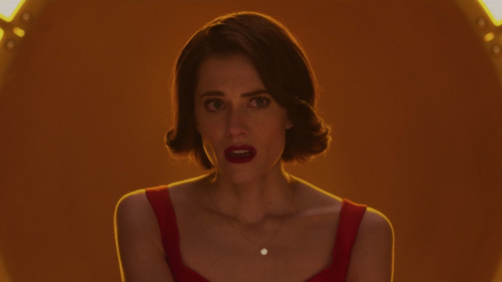
Allison Williams in The Perfection
Netflix/Cooke Optics
Zoic Studios: www.zoicstudios.com
Crafts: VFX/Animation
Sections: Creativity
Topics: Project/Case study adobe andrew orloff autodesk foundry maya Nuke Photoshop rob price VFX zoic studios
Did you enjoy this article? Sign up to receive the StudioDaily Fix eletter containing the latest stories, including news, videos, interviews, reviews and more.


