After a brain injury, people often struggle to regain the ability to do things we ordinarily take for granted, like organize thoughts, understand speech and even talk. It’s hard to imagine what that recovery process must feel like, but that was the assignment Rio de Janeiro-based Lightfarm took on while working with New York health advertising agency Area 23 on “One Word,” a video promo for Learning Corp’s new Constant Therapy app. Using a combination of Maxon Cinema 4D, Blender Eevee, Zbrush, SideFX Houdini, and Adobe After Effects and Photoshop, Lightfarm and Area 23 spent two months working on the video, which recently won a Gold Lion for Best Film at the Cannes Lions International Festival of Creativity.
We asked Lightfarm’s Creative Director Rafael Vallaperde and Director of Animation, Kawe de Sá, to describe the making of “One Word,” which begins with a toddler’s nap and turns into something much more ominous. (Watch the making-of video here: https://vimeo.com/342775927.)

Kawe de Sá often uses Post-It notes to organize ideas when coming up with the baseline for stories. “Because if a shot will work in that small space it will work anywhere,” he says.
Why did Area 23 choose Lightfarm for this project?
Rafael Vallaperde: We’ve been partnering with them for quite a while and felt like we were building up to doing special projects like these. And when the opportunity did come, they chose us.
Kawe de Sá: I think it’s also because Lightfarm is known for doing projects that are outside the box. Most clients come to us with very unique briefings, and we have to work closely with them to figure out a way to make their ideas viable.

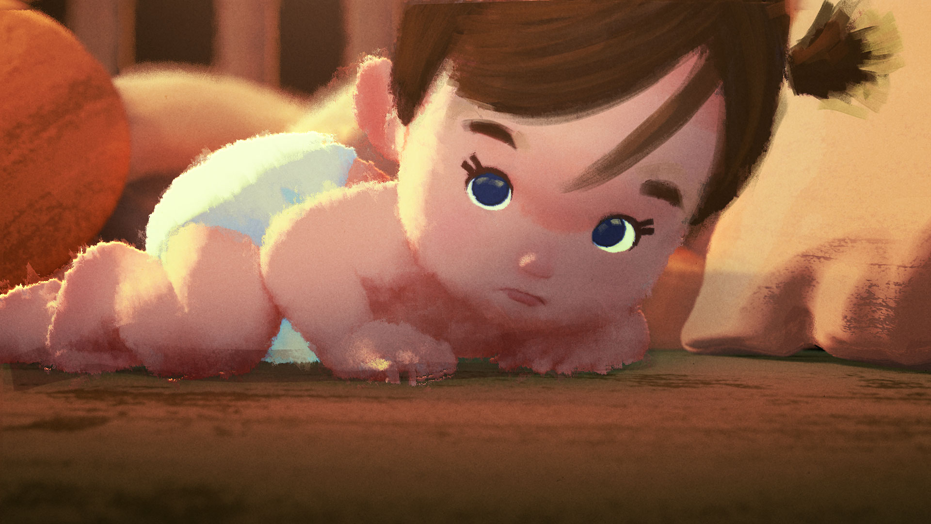
Modeled from scratch in ZBrush, the baby went through many iterations, including this one that was deemed a bit too cute and cartoon-like.
How did you hone Lightfarm’s style and get your name out there?
R.V.: Whenever we have time, we work on our own original projects where Lightfarm is the client. It helped when we hired Kawe because I, and Milton Menezes, who co-founded Lightfarm with me, come from a print background. Kawe helped us come up with interesting videos, and we’ve spent a lot of time creating those because we knew we wanted to do this kind of work, but we didn’t have anything to show we could do it.
Those projects always help us learn how to do different things and try out creative ideas. And posting them has helped clients understand what we can do and how we can put energy and style into their brands. They’ve definitely attracted some new people to us. [Check out Lightfarm’s personal portfolio.]
Bloom, the story of a firefly who discovers nature’s dangers, is one of Lightfarm’s many personal projects.
What kind of direction did you get, and how did you decide how to tell the story?
R.V.: It was a difficult briefing because the client wanted us to do something abstract rather than figurative, and we needed to convey something very complex. We spent about two months trying out ideas, but neither us nor the client could decide on a script that we could follow and really liked. They had, like, a 15-page script for a two-minute video, so we knew that wouldn’t work. I think it started working when we put things in place to just tell the story visually so we could convey the emotions of desperation and fear and confusion people feel when they are struggling with a brain injury.

The story ends with a mother using the app in a room with an empty crib. The meaning of the scene is left open to interpretation.
de Sá: There were points in the 15-page script that we tried to hit, but mostly we just tried to make everything very fast-paced and action-packed like a roller-coaster ride. You see the baby and she’s all cozy and then suddenly she’s sucked up by a hurricane, which is conveying a sense of what trauma really is. You see the baby go through all of these scary things, but the baby is not really the focus of the story.


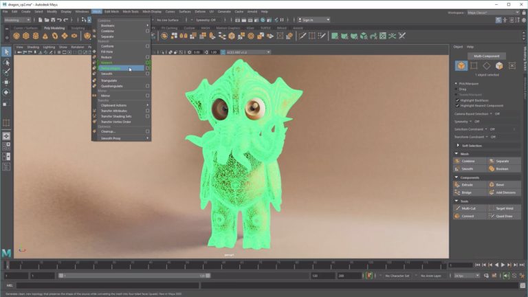
To create the model of the bee on a tight deadline, de Sá says he “just messed up the model by pulling vertexes around to get a weird, terrifying look.”
That’s why we don’t show the action from the baby’s point of view. This was our way of showing what the mom was feeling as she tried to connect the links in her brain to remember the word baby. Not having the baby in the crib at the end was really hard for us because we got really attached to that baby. But the client wanted the ending to be focused on the mom, so you’re left wondering what happened to the baby. Was there some kind of accident?
Were you trying to make the video look and feel like an illustration?
de Sá: Yes, we were really chasing an illustration feel and we wanted it to look stunning. We didn’t have time to create a storyboard or an animatic, so we started by placing a camera in Cinema 4D and sculpting a background that worked. I animated the camera from there, and we had to test things out a lot. That was really interesting from start to finish. We used Blender, which has a new engine called Eevee that allowed us to render in real time. And [Adobe] After Effects was great for giving the render a 2D look that our illustrators painted over to integrate the 2D and 3D feel.

Color keys created in Photoshop by Lightfarm artist Giselle Almeida served as the team’s “Holy Grail,” as they worked in 3D.
This was the first time I’ve ever animated anything that had one camera and no cuts. We just went from one scene to the next, and we’d be thinking ‘Okay, where do we go from this angle?’ We were always trying to follow the motion from the best angles, which we had to discover as we went along. We took screenshots from key moments and our illustrators went over them, which really helped give us a sense of how the video would go. After we were done blocking and creating color keys, we started splitting the continuous shot into scenes and that was easier to work with.

Just when you think the baby is going to get a little time to rest, the cute teddy bear turns into a frightening monster.
Do you have a favorite scene?
R.V.: The evil teddy bear was a lot of fun. The client first thought the bear wasn’t evil enough, but then it opened its mouth and they were like, ‘Oh, that’s so scary!’ We really wanted a contrast between the tiny baby and the huge bear, and the baby’s wondering what she’s going to do now. After making the 3D model in ZBrush and Cinema 4D, one of our illustrators worked in Photoshop to get the dynamics of the saliva right. We were on such a tight deadline, we did what we could to make things work, like you can see how the jaggy look of the low-poly model gives the feeling of spiky hair.

After modeling in ZBrush and Cinema 4D, Lightfarm artists used Photoshop and After Effects to enhance details, like the bear’s saliva, in 2D.
How was this project different from what you normally do?
R.V.: We discovered so many things about this project as we worked. I think some people might call us crazy, but we were always trying to make this really great. We weren’t afraid to take risks, and sometimes we had to tell our client something just wasn’t going to work, but we did it in a positive way and we have a great relationship with them. We were working right up until the deadline on this. I think we rendered the last scene a day before it was due because we were going back and forth so much on changes.
It was a lot of pressure and everyone felt it. But everyone also felt like this project was special, so we’d tell people to go home and they’d be like, ‘No, no, I want to stay and finish this.’ In the end, it was an important process for the studio. We learned a lot and earned our first big prize, and that was great.
Crafts: VFX/Animation
Sections: Creativity
Topics: Project/Case study adobe After Effects Blender cinema 4d eevee Houdini Maxon Photoshop sidefx zbrush
Did you enjoy this article? Sign up to receive the StudioDaily Fix eletter containing the latest stories, including news, videos, interviews, reviews and more.


