Claire Folger / MRC II Distribution
Knives Out, writer-director Rian Johnson’s fond, fast-paced and funny homage to detective fiction — and Agatha Christie in particular — reunites Johnson with cinematographer Steve Yedlin, ASC, his behind-the-camera collaborator since his 2005 debut film, Brick. Yedlin, a member of the AMPAS Science and Technology Council, advocates for ways of considering the photographic image that go beyond the base level of camera specs and pixel-counting. Instead, he argues for a focus on color and tonal rendering and color pipeline design rather than a fixation on issues like digital vs. film, or counting Ks on a camera’s sensor. To get an idea where he’s coming from, check out “On Acquisition and Pipeline for High Resolution Exhibition,” a demo he created in 2016. In Part 1, subtitled “The Resolution Myth,” he juxtaposes the same footage shot with different cameras and formats as part of an argument against resolution and camera selection being the most important factors in an audience’s experience with an image. His website, yedlin.net, is full of writing documenting his thoughts on resolution, color science, and other topics.
Knives Out was acquired almost entirely with the Arri Alexa Mini, save for one Alexa 65 shot (the switch was made for VFX considerations), one 35mm film shot, and a few more captured with a drone camera. But Yedlin is keen to point out that his camera choices are made for practical, not aesthetic reasons. FotoKem had previously integrated some of Yedlin’s custom-written algorithms into its pipeline for Star Wars: The Last Jedi, but Knives Out took that methodology to a new level, giving the DP an enormous degree of control over the precise look of the finished image, regardless of which device captured the footage. The final goal, of course, is to tell the story in the best way possible.
Yedlin answered our questions about the project, with a little help from colorist Aidan Stanford at FotoKem, where the 2K master was created, via email.
StudioDaily: What kind of discussions did you have with Rian Johnson about the look? Did you use references?
Steve Yedlin: Although I appreciate discussing visual references, such as films or paintings, I like to limit the prep time spent on “Yes, we have the same taste,” and pretty quickly get into rolling up our sleeves and designing the unique project at hand. That way, we make meaningful use of our precious prep time. One thing Rian and I did discuss in our brief references phase of Knives Out was the [Robert] Altman style of weaving characters together in a space with a fluid, evolving camera that combines dolly moves, zooms and pans. That was a basic guiding principle for us. Then we dove in to planning the actual shots so that when we showed up on set, we had a trajectory.
Prep on Rian’s movies always feels like the most useful kind of prep: honing in from the broad to fine strokes as we go, not wasting time repeatedly wiping the drawing board clean and restarting. If you do that too many times, by the time you get to the end of prep, you’re on the 10th stab at a first draft instead of a 10th draft. For example, having a fine-grained plan, like knowing that Rian is confident that he wants a character to lean out of darkness on a certain line in a certain scene, or that he wants characters to appear to be lit only by upstage firelight in another, allows me to focus in on planning details rather than spiraling on covering for innumerable possibilities. There were also cases where knowing Rian’s shots to a pretty fine degree in advance allowed me to order more versatile zoom lenses for the run of the show, and to plan targeted one-day rentals of a more special purpose zoom for specific shots — since we knew when the demand would arise.
We also talked about capturing the natural, steely, winter window light at the main mansion location, which was a private residence in a Boston suburb. I had many time-of-day specific plans to get the looks Rian and I had discussed, so there was a lot of collaboration with assistant director Jamie Christopher in figuring out how to make those wishes fit with all the other elaborate demands of his schedule — and it’s really impressive what he managed to pull off.
For augmenting the real light in the mansion (both window light and practical light), we used Arri SkyPanels alongside an array of lightweight LED panels custom-built by gaffer Josh Davis’s team. As the light shifted either between or during scenes, I wanted to be able to match it tightly with our movie lights so that they truly were subtle augmentation and didn’t look artificial or incongruous. So we used a handheld spectrometer to measure the chromaticity coordinates of the light we wanted to match. With the Arri SkyPanels, we were able to directly feed those coordinates into the lamp for a match. For the custom-built lights, I had written a custom app that would calculate the correct illuminant blend to yield the measured color.
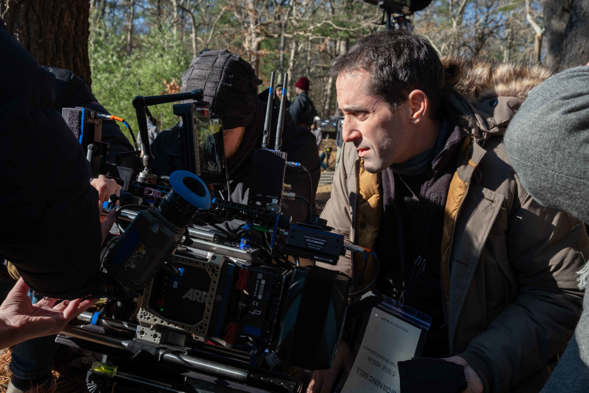
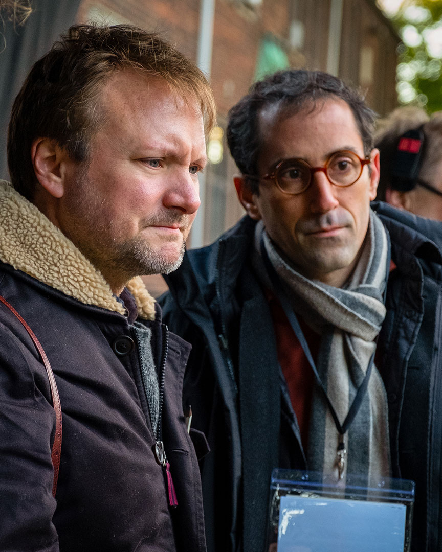
Cinematographer Steve Yedlin, ASC, shooting Knives Out on location.
Claire Folger / MRC II Distribution
Why did you decide to shoot Knives Out mainly with the Alexa Mini?
SY: When the artistry of visual authorship is decoupled from the camera format, selection of that format becomes technical/operational rather than artistic. I chose the Alexa Mini for its excellent colorimetric reliability, low noise, sensor size that could be covered by the lenses I wanted to use, and its ability to go up to 200 frames per second without having to change our framing area (i.e. “window in”). I also have a color pipeline already designed for it and didn’t need to start from scratch. Since I know I’ll sculpt the color/tonal rendition to my vision no matter which camera I select, I’m free to choose the camera type that is the pragmatic best choice for getting our shots.
I understand you applied an algorithm to get a look often done optically, similar to one of the characteristics of anamorphic. Can you tell me about that?
SY: I didn’t want all of the visual idiosyncrasies that come with shooting anamorphic. [Note: Yedlin cites four common, recognizable attributes of anamorphic lenses: the blue line flare, the “anamorphic egg” (the inability of anamorphic lenses to focus from center to edges), elliptical bokeh, and curvature.] Of the one attribute I did partially want — curvature — I didn’t want it exactly as it would have been delivered by anamorphic lenses, so we created our own version with an algorithm that we were able to better tune to our taste. That algorithm adds some curvature to the image, taking a rectilinear projection of the 3D world onto a 2D plane and converting it to an equisolid projection.
This video clip prepared by Yedlin visualizes an image photographed with a rectilinear lens being converted to equisolid via specially prepared algorithms.
To me, that equisolid — or semi-equisolid — look can be subtly more artful and softer compared to what can sometimes be a more clinical feeling of rectilinear geometry.
By working to develop the algorithms to my taste, rather than just doing a literal emulation of anamorphic curvature, we got the look we were aiming for. To my taste, a small amount of curvature can lend a more organic feel, but too much, as you sometimes get from the wider end of the anamorphic lenses, can be obnoxious and distracting. By getting our equisolid look with an algorithm instead of by selection of lens models, we were able to tailor it instead of being stuck with whatever the lenses happen to do.
[Note: For more detailed background, refer to these articles at Yedlin’s website: Lens Blur, Lens Blur Followup and Large Format Fallacies.]
Tell us about your collaboration on the grading process.
SY: I’ve known colorist Aidan Stanford for 15 years. He was a regular film-timer of mine in the photochemical days. It was exciting to reconnect with him at FotoKem on this movie. Aidan has an amazingly nuanced eye for skin tones and subtle color balance. Because we had the LUT and overall look buttoned up before we started, the broad strokes were out of the way, and we could spend all our grading time together on nuance and finesse and really make use of Aidan’s expertise.
Aidan Stanford: I’ve always enjoyed working with Steve. It’s no secret that he is one of the most talented and technically sound cinematographers working today. I’ve leaned on Steve many times over the years for color science and pipeline information. I was excited to get back into a theater with him on Knives Out.
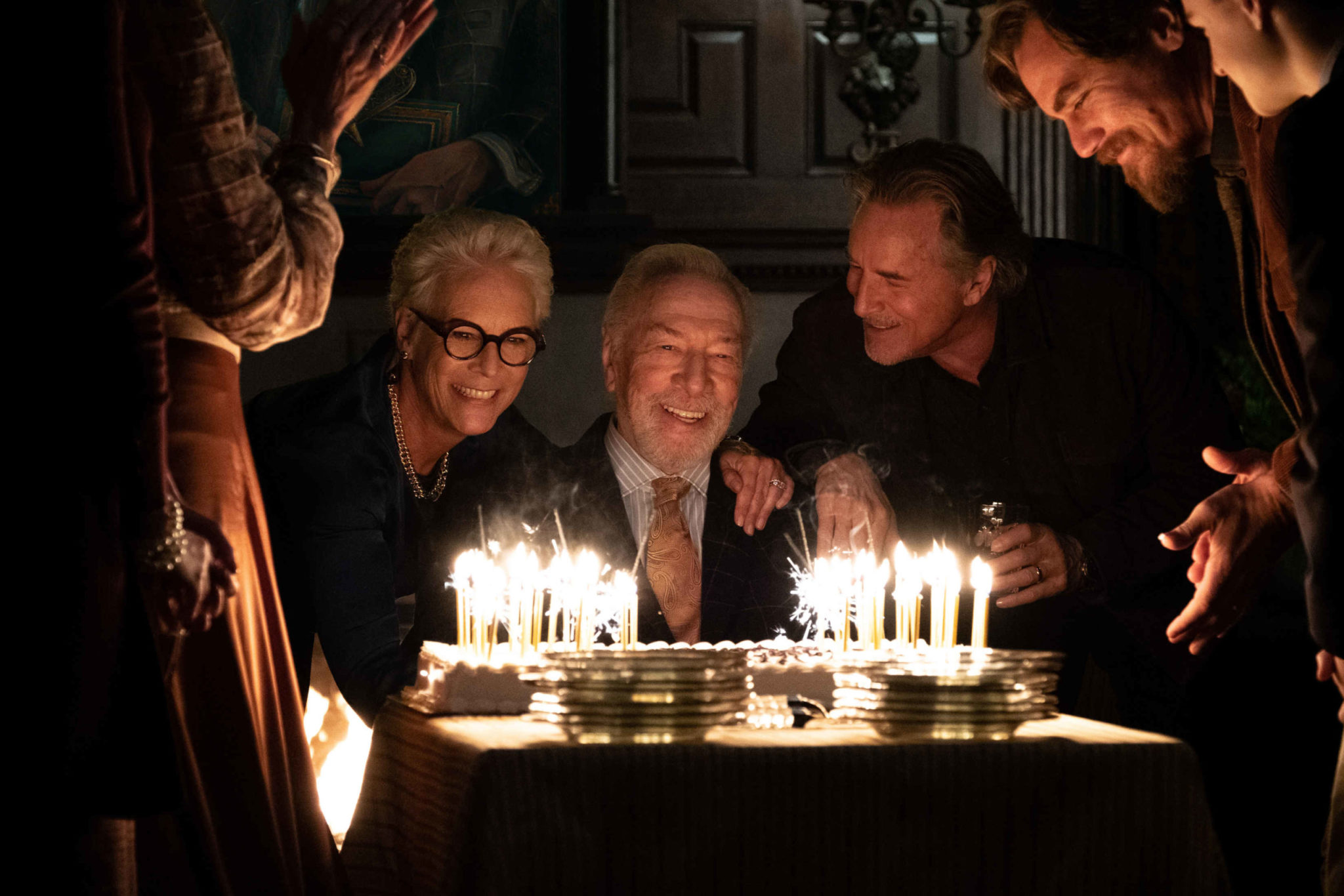
From left: Jamie Lee Curtis, Christopher Plummer, Don Johnson and Michael Shannon in Knives Out.
Claire Folger / MRC II Distribution
What custom color grading tools did you use, and why?
SY: Aidan works on [Blackmagic DaVinci] Resolve. Most of my custom pipeline tools have not been ported into Resolve, and they are not really color-grading tools that we’d want to adjust at that point in the process anyway, so they get rendered prior to the color session. But the tool I did want to be able to use on the fly in the grade is what we call “Tetra.” It’s a way to gently isolate or target specific areas of the color cube, so it’s similar in general purpose to the usual Secondaries or Hue vs Hue or Hue vs Saturation tools, but it uses different underlying math so that the results are smoother and more natural to my taste. To my eye, I can go further with Tetra without it looking like an artificial affectation.
The Tetra tool was ported into Resolve by FotoKem’s own Eric Cameron. Aidan only needed it for a few specific scenes, but it was great for its purpose in those. We used it, for example, in some of the firelight scenes to reduce the intensity of the fire’s orange without changing its vector.
AS: We met before the grading process and discussed expectations and implementations of the Tetra plugin and node structure for the Resolve, etc. Initially for the early color pass, we went through each reel and set looks for each scene, then Steve would say “OK, let me know when I should watch.” I went through and matched shots using mostly offset and printer point style upstream of our show LUT. Once I had things where I thought it was ready to go, we’d review the same way we did back in the film print days. We used a notepad, footage/timecode counter, and we discussed possible adjustment and where we may want to use the Tetra adjustment. The footage is so well lit and the LUT is so predictable that I was able to focus on really getting things finessed in the DI.
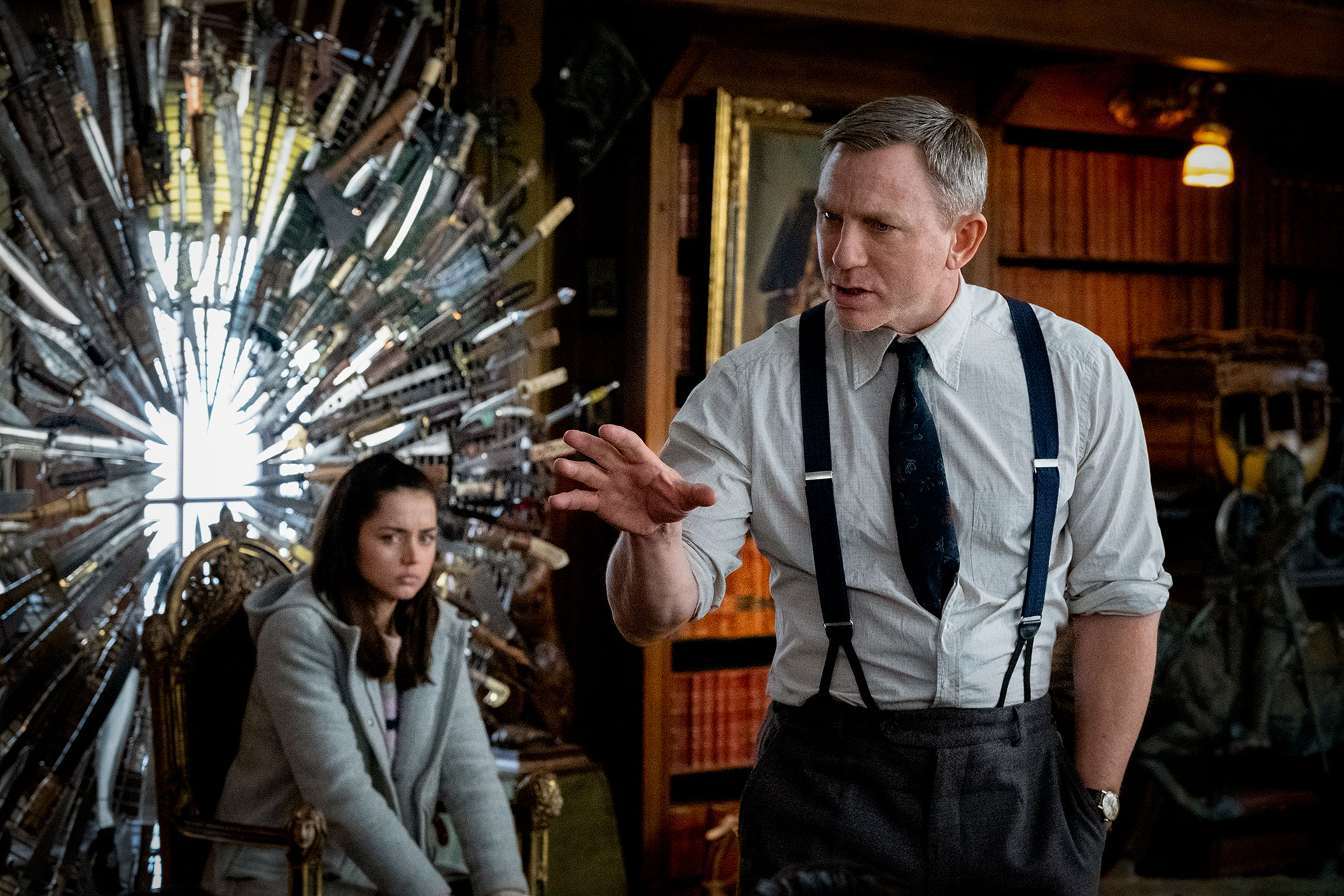
Ana de Armas and Daniel Craig in Knives Out
Claire Folger / MRC II Distribution
Can you give me a specific example of how the image benefited from the new tools that you developed?
SY: Tools don’t make things; people make things using tools. These tools allowed us to work the way we wanted: by designing the pipeline to our taste before we started instead of continuously redesigning it as we go. We were free to spend our limited time and resources focused on what really matters for visual authorship and not on overly broad strokes or reinventing the wheel or troubleshooting. So there may not be one specific visible example to point to in the images. Instead, we were able to do our image authorship in just the type of working style we like without struggling or spiraling or employing absurd extravagances.
AS: There are a handful of scenes in Knives Out that really benefited from the Tetra trick. I used it mostly to control red, but also to pull back. There was a scene early on in the grading that I had cooled down using my printer point style grading. Rian Johnson pointed out during a review that he was feeling a bit of cyan even though the skin tones and overall warmth were pretty spot on. Trying the Tetra adjustment instead, I was able to get the harsher red out of the exact tones where we wanted it out, but the more neutral tones and some of the brighter areas of the frame remained exactly where intended. All of this without a power window or secondaries. Once we figured out the type of hue and saturation levels that benefited from the Tetra adjustment, it became my default adjustment to really dial things in.
For the last shot of the movie, I actually used it to add some punch to a specific tone. To me it felt a bit like using an old Hazeltine [film analyzer] at the lab only for a specific hue. I had full control over density as well as color within the hue.
Were there any challenges when it came to color management for dailies and editorial?
SY: FotoKem’s Jon Rocke did dailies on their NextLab platform. He’s done dailies for me on my last three films there. Jon knows how to do his thing while working with my LUT and keeping it to printer light-style adjustments. Since the overall look was already set, the main goal for dailies was shot-to-shot balance. He’s got a great eye for that. FotoKem also burned the CDL into dailies, so I could see a numerical read-out of what Jon had done. That’s useful for me to understand if something I’m seeing in dailies is a result of how I’m lighting and exposing or if it’s in the dailies grade. And, even more useful, with nextLAB, they also pull a single uncompressed frame from every shot for me with no LUT or grade that I can bring into my computer and review with live (rather than burned in) LUT and grade, which is an even more direct way to evaluate what we’ve captured.
What were the deliverables?
AS: I was fortunate to have Steve attend and approve all of the deliverables: the theater grade as the master and SDR, HDR, and Dolby Vision passes, as well as a good old-fashioned film print.
Crafts: Shooting
Sections: Creativity
Topics: Project/Case study Q&A alexa mini ARRI color science Fotokem skypanels steve yedlin tetra
Did you enjoy this article? Sign up to receive the StudioDaily Fix eletter containing the latest stories, including news, videos, interviews, reviews and more.

